User login
Overburdened: Health care workers more likely to die by suicide
This transcript has been edited for clarity.
Welcome to Impact Factor, your weekly dose of commentary on a new medical study.
If you run into a health care provider these days and ask, “How are you doing?” you’re likely to get a response like this one: “You know, hanging in there.” You smile and move on. But it may be time to go a step further. If you ask that next question – “No, really, how are you doing?” Well, you might need to carve out some time.
It’s been a rough few years for those of us in the health care professions. Our lives, dominated by COVID-related concerns at home, were equally dominated by COVID concerns at work. On the job, there were fewer and fewer of us around as exploitation and COVID-related stressors led doctors, nurses, and others to leave the profession entirely or take early retirement. Even now, I’m not sure we’ve recovered. Staffing in the hospitals is still a huge problem, and the persistence of impersonal meetings via teleconference – which not only prevent any sort of human connection but, audaciously, run from one into another without a break – robs us of even the subtle joy of walking from one hallway to another for 5 minutes of reflection before sitting down to view the next hastily cobbled together PowerPoint.
I’m speaking in generalities, of course.
I’m talking about how bad things are now because, in truth, they’ve never been great. And that may be why health care workers – people with jobs focused on serving others – are nevertheless at substantially increased risk for suicide.
Analyses through the years have shown that physicians tend to have higher rates of death from suicide than the general population. There are reasons for this that may not entirely be because of work-related stress. Doctors’ suicide attempts are more often lethal – we know what is likely to work, after all.
And, according to this paper in JAMA, it is those people who may be suffering most of all.
The study is a nationally representative sample based on the 2008 American Community Survey. Records were linked to the National Death Index through 2019.
Survey respondents were classified into five categories of health care worker, as you can see here. And 1,666,000 non–health care workers served as the control group.
Let’s take a look at the numbers.
I’m showing you age- and sex-standardized rates of death from suicide, starting with non–health care workers. In this study, physicians have similar rates of death from suicide to the general population. Nurses have higher rates, but health care support workers – nurses’ aides, home health aides – have rates nearly twice that of the general population.
Only social and behavioral health workers had rates lower than those in the general population, perhaps because they know how to access life-saving resources.
Of course, these groups differ in a lot of ways – education and income, for example. But even after adjustment for these factors as well as for sex, race, and marital status, the results persist. The only group with even a trend toward lower suicide rates are social and behavioral health workers.
There has been much hand-wringing about rates of physician suicide in the past. It is still a very real problem. But this paper finally highlights that there is a lot more to the health care profession than physicians. It’s time we acknowledge and support the people in our profession who seem to be suffering more than any of us: the aides, the techs, the support staff – the overworked and underpaid who have to deal with all the stresses that physicians like me face and then some.
There’s more to suicide risk than just your job; I know that. Family matters. Relationships matter. Medical and psychiatric illnesses matter. But to ignore this problem when it is right here, in our own house so to speak, can’t continue.
Might I suggest we start by asking someone in our profession – whether doctor, nurse, aide, or tech – how they are doing. How they are really doing. And when we are done listening, we use what we hear to advocate for real change.
Dr. Wilson is associate professor of medicine and public health and director of the Clinical and Translational Research Accelerator at Yale University, New Haven, Conn. He has disclosed no relevant financial relationships.
A version of this article appeared on Medscape.com.
This transcript has been edited for clarity.
Welcome to Impact Factor, your weekly dose of commentary on a new medical study.
If you run into a health care provider these days and ask, “How are you doing?” you’re likely to get a response like this one: “You know, hanging in there.” You smile and move on. But it may be time to go a step further. If you ask that next question – “No, really, how are you doing?” Well, you might need to carve out some time.
It’s been a rough few years for those of us in the health care professions. Our lives, dominated by COVID-related concerns at home, were equally dominated by COVID concerns at work. On the job, there were fewer and fewer of us around as exploitation and COVID-related stressors led doctors, nurses, and others to leave the profession entirely or take early retirement. Even now, I’m not sure we’ve recovered. Staffing in the hospitals is still a huge problem, and the persistence of impersonal meetings via teleconference – which not only prevent any sort of human connection but, audaciously, run from one into another without a break – robs us of even the subtle joy of walking from one hallway to another for 5 minutes of reflection before sitting down to view the next hastily cobbled together PowerPoint.
I’m speaking in generalities, of course.
I’m talking about how bad things are now because, in truth, they’ve never been great. And that may be why health care workers – people with jobs focused on serving others – are nevertheless at substantially increased risk for suicide.
Analyses through the years have shown that physicians tend to have higher rates of death from suicide than the general population. There are reasons for this that may not entirely be because of work-related stress. Doctors’ suicide attempts are more often lethal – we know what is likely to work, after all.
And, according to this paper in JAMA, it is those people who may be suffering most of all.
The study is a nationally representative sample based on the 2008 American Community Survey. Records were linked to the National Death Index through 2019.
Survey respondents were classified into five categories of health care worker, as you can see here. And 1,666,000 non–health care workers served as the control group.
Let’s take a look at the numbers.
I’m showing you age- and sex-standardized rates of death from suicide, starting with non–health care workers. In this study, physicians have similar rates of death from suicide to the general population. Nurses have higher rates, but health care support workers – nurses’ aides, home health aides – have rates nearly twice that of the general population.
Only social and behavioral health workers had rates lower than those in the general population, perhaps because they know how to access life-saving resources.
Of course, these groups differ in a lot of ways – education and income, for example. But even after adjustment for these factors as well as for sex, race, and marital status, the results persist. The only group with even a trend toward lower suicide rates are social and behavioral health workers.
There has been much hand-wringing about rates of physician suicide in the past. It is still a very real problem. But this paper finally highlights that there is a lot more to the health care profession than physicians. It’s time we acknowledge and support the people in our profession who seem to be suffering more than any of us: the aides, the techs, the support staff – the overworked and underpaid who have to deal with all the stresses that physicians like me face and then some.
There’s more to suicide risk than just your job; I know that. Family matters. Relationships matter. Medical and psychiatric illnesses matter. But to ignore this problem when it is right here, in our own house so to speak, can’t continue.
Might I suggest we start by asking someone in our profession – whether doctor, nurse, aide, or tech – how they are doing. How they are really doing. And when we are done listening, we use what we hear to advocate for real change.
Dr. Wilson is associate professor of medicine and public health and director of the Clinical and Translational Research Accelerator at Yale University, New Haven, Conn. He has disclosed no relevant financial relationships.
A version of this article appeared on Medscape.com.
This transcript has been edited for clarity.
Welcome to Impact Factor, your weekly dose of commentary on a new medical study.
If you run into a health care provider these days and ask, “How are you doing?” you’re likely to get a response like this one: “You know, hanging in there.” You smile and move on. But it may be time to go a step further. If you ask that next question – “No, really, how are you doing?” Well, you might need to carve out some time.
It’s been a rough few years for those of us in the health care professions. Our lives, dominated by COVID-related concerns at home, were equally dominated by COVID concerns at work. On the job, there were fewer and fewer of us around as exploitation and COVID-related stressors led doctors, nurses, and others to leave the profession entirely or take early retirement. Even now, I’m not sure we’ve recovered. Staffing in the hospitals is still a huge problem, and the persistence of impersonal meetings via teleconference – which not only prevent any sort of human connection but, audaciously, run from one into another without a break – robs us of even the subtle joy of walking from one hallway to another for 5 minutes of reflection before sitting down to view the next hastily cobbled together PowerPoint.
I’m speaking in generalities, of course.
I’m talking about how bad things are now because, in truth, they’ve never been great. And that may be why health care workers – people with jobs focused on serving others – are nevertheless at substantially increased risk for suicide.
Analyses through the years have shown that physicians tend to have higher rates of death from suicide than the general population. There are reasons for this that may not entirely be because of work-related stress. Doctors’ suicide attempts are more often lethal – we know what is likely to work, after all.
And, according to this paper in JAMA, it is those people who may be suffering most of all.
The study is a nationally representative sample based on the 2008 American Community Survey. Records were linked to the National Death Index through 2019.
Survey respondents were classified into five categories of health care worker, as you can see here. And 1,666,000 non–health care workers served as the control group.
Let’s take a look at the numbers.
I’m showing you age- and sex-standardized rates of death from suicide, starting with non–health care workers. In this study, physicians have similar rates of death from suicide to the general population. Nurses have higher rates, but health care support workers – nurses’ aides, home health aides – have rates nearly twice that of the general population.
Only social and behavioral health workers had rates lower than those in the general population, perhaps because they know how to access life-saving resources.
Of course, these groups differ in a lot of ways – education and income, for example. But even after adjustment for these factors as well as for sex, race, and marital status, the results persist. The only group with even a trend toward lower suicide rates are social and behavioral health workers.
There has been much hand-wringing about rates of physician suicide in the past. It is still a very real problem. But this paper finally highlights that there is a lot more to the health care profession than physicians. It’s time we acknowledge and support the people in our profession who seem to be suffering more than any of us: the aides, the techs, the support staff – the overworked and underpaid who have to deal with all the stresses that physicians like me face and then some.
There’s more to suicide risk than just your job; I know that. Family matters. Relationships matter. Medical and psychiatric illnesses matter. But to ignore this problem when it is right here, in our own house so to speak, can’t continue.
Might I suggest we start by asking someone in our profession – whether doctor, nurse, aide, or tech – how they are doing. How they are really doing. And when we are done listening, we use what we hear to advocate for real change.
Dr. Wilson is associate professor of medicine and public health and director of the Clinical and Translational Research Accelerator at Yale University, New Haven, Conn. He has disclosed no relevant financial relationships.
A version of this article appeared on Medscape.com.
Laboratory testing: No doctor required?
This transcript has been edited for clarity.
Let’s assume, for the sake of argument, that I am a healthy 43-year old man. Nevertheless, I am interested in getting my vitamin D level checked. My primary care doc says it’s unnecessary, but that doesn’t matter because a variety of direct-to-consumer testing companies will do it without a doctor’s prescription – for a fee of course.
Is that okay? Should I be able to get the test?
What if instead of my vitamin D level, I want to test my testosterone level, or my PSA, or my cadmium level, or my Lyme disease antibodies, or even have a full-body MRI scan?
These questions are becoming more and more common, because the direct-to-consumer testing market is exploding.
We’re talking about direct-to-consumer testing, thanks to this paper: Policies of US Companies Offering Direct-to-Consumer Laboratory Tests, appearing in JAMA Internal Medicine, which characterizes the testing practices of direct-to-consumer testing companies.
But before we get to the study, a word on this market. Direct-to-consumer lab testing is projected to be a $2 billion industry by 2025, and lab testing megacorporations Quest Diagnostics and Labcorp are both jumping headlong into this space.
Why is this happening? A couple of reasons, I think. First, the increasing cost of health care has led payers to place significant restrictions on what tests can be ordered and under what circumstances. Physicians are all too familiar with the “prior authorization” system that seeks to limit even the tests we think would benefit our patients.
Frustrated with such a system, it’s no wonder that patients are increasingly deciding to go it on their own. Sure, insurance won’t cover these tests, but the prices are transparent and competition actually keeps them somewhat reasonable. So, is this a win-win? Shouldn’t we allow people to get the tests they want, at least if they are willing to pay for it?
Of course, it’s not quite that simple. If the tests are normal, or negative, then sure – no harm, no foul. But when they are positive, everything changes. What happens when the PSA test I got myself via a direct-to-consumer testing company comes back elevated? Well, at that point, I am right back into the traditional mode of medicine – seeing my doctor, probably getting repeat testing, biopsies, etc., – and some payer will be on the hook for that, which is to say that all of us will be on the hook for that.
One other reason direct-to-consumer testing is getting more popular is a more difficult-to-characterize phenomenon which I might call postpandemic individualism. I’ve seen this across several domains, but I think in some ways the pandemic led people to focus more attention on themselves, perhaps because we were so isolated from each other. Optimizing health through data – whether using a fitness tracking watch, meticulously counting macronutrient intake, or ordering your own lab tests – may be a form of exerting control over a universe that feels increasingly chaotic. But what do I know? I’m not a psychologist.
The study characterizes a total of 21 direct-to-consumer testing companies. They offer a variety of services, as you can see here, with the majority in the endocrine space: thyroid, diabetes, men’s and women’s health. A smattering of companies offer more esoteric testing, such as heavy metals and Lyme disease.
Who’s in charge of all this? It’s fairly regulated, actually, but perhaps not in the way you think. The FDA uses its CLIA authority to ensure that these tests are accurate. The FTC ensures that the companies do not engage in false advertising. But no one is minding the store as to whether the tests are actually beneficial either to an individual or to society.
The 21 companies varied dramatically in regard to how they handle communicating the risks and results of these tests. All of them had a disclaimer that the information does not represent comprehensive medical advice. Fine. But a minority acknowledged any risks or limitations of the tests. Less than half had a statement of HIPAA compliance. And 17 out of 21 provided no information as to whether customers could request their data to be deleted, while 18 out of 21 stated that there could be follow-up for abnormal results, but often it was unclear exactly how that would work.
So, let’s circle back to the first question: Should a healthy person be able to get a laboratory test simply because they want to? The libertarians among us would argue certainly yes, though perhaps without thinking through the societal implications of abnormal results. The evidence-based medicine folks will, accurately, state that there are no clinical trials to suggest that screening healthy people with tests like these has any benefit.
But we should be cautious here. This question is scienceable; you could design a trial to test whether screening healthy 43-year-olds for testosterone level led to significant improvements in overall mortality. It would just take a few million people and about 40 years of follow-up.
And even if it didn’t help, we let people throw their money away on useless things all the time. The only difference between someone spending money on a useless test or on a useless dietary supplement is that someone has to deal with the result.
So, can you do this right? Can you make a direct-to-consumer testing company that is not essentially a free-rider on the rest of the health care ecosystem?
I think there are ways. You’d need physicians involved at all stages to help interpret the testing and guide next steps. You’d need some transparent guidelines, written in language that patients can understand, for what will happen given any conceivable result – and what costs those results might lead to for them and their insurance company. Most important, you’d need longitudinal follow-up and the ability to recommend changes, retest in the future, and potentially address the cost implications of the downstream findings. In the end, it starts to sound very much like a doctor’s office.
F. Perry Wilson, MD, MSCE, is an associate professor of medicine and public health and director of Yale’s Clinical and Translational Research Accelerator in New Haven, Conn. He reported no relevant conflicts of interest.
A version of this article first appeared on Medscape.com.
This transcript has been edited for clarity.
Let’s assume, for the sake of argument, that I am a healthy 43-year old man. Nevertheless, I am interested in getting my vitamin D level checked. My primary care doc says it’s unnecessary, but that doesn’t matter because a variety of direct-to-consumer testing companies will do it without a doctor’s prescription – for a fee of course.
Is that okay? Should I be able to get the test?
What if instead of my vitamin D level, I want to test my testosterone level, or my PSA, or my cadmium level, or my Lyme disease antibodies, or even have a full-body MRI scan?
These questions are becoming more and more common, because the direct-to-consumer testing market is exploding.
We’re talking about direct-to-consumer testing, thanks to this paper: Policies of US Companies Offering Direct-to-Consumer Laboratory Tests, appearing in JAMA Internal Medicine, which characterizes the testing practices of direct-to-consumer testing companies.
But before we get to the study, a word on this market. Direct-to-consumer lab testing is projected to be a $2 billion industry by 2025, and lab testing megacorporations Quest Diagnostics and Labcorp are both jumping headlong into this space.
Why is this happening? A couple of reasons, I think. First, the increasing cost of health care has led payers to place significant restrictions on what tests can be ordered and under what circumstances. Physicians are all too familiar with the “prior authorization” system that seeks to limit even the tests we think would benefit our patients.
Frustrated with such a system, it’s no wonder that patients are increasingly deciding to go it on their own. Sure, insurance won’t cover these tests, but the prices are transparent and competition actually keeps them somewhat reasonable. So, is this a win-win? Shouldn’t we allow people to get the tests they want, at least if they are willing to pay for it?
Of course, it’s not quite that simple. If the tests are normal, or negative, then sure – no harm, no foul. But when they are positive, everything changes. What happens when the PSA test I got myself via a direct-to-consumer testing company comes back elevated? Well, at that point, I am right back into the traditional mode of medicine – seeing my doctor, probably getting repeat testing, biopsies, etc., – and some payer will be on the hook for that, which is to say that all of us will be on the hook for that.
One other reason direct-to-consumer testing is getting more popular is a more difficult-to-characterize phenomenon which I might call postpandemic individualism. I’ve seen this across several domains, but I think in some ways the pandemic led people to focus more attention on themselves, perhaps because we were so isolated from each other. Optimizing health through data – whether using a fitness tracking watch, meticulously counting macronutrient intake, or ordering your own lab tests – may be a form of exerting control over a universe that feels increasingly chaotic. But what do I know? I’m not a psychologist.
The study characterizes a total of 21 direct-to-consumer testing companies. They offer a variety of services, as you can see here, with the majority in the endocrine space: thyroid, diabetes, men’s and women’s health. A smattering of companies offer more esoteric testing, such as heavy metals and Lyme disease.
Who’s in charge of all this? It’s fairly regulated, actually, but perhaps not in the way you think. The FDA uses its CLIA authority to ensure that these tests are accurate. The FTC ensures that the companies do not engage in false advertising. But no one is minding the store as to whether the tests are actually beneficial either to an individual or to society.
The 21 companies varied dramatically in regard to how they handle communicating the risks and results of these tests. All of them had a disclaimer that the information does not represent comprehensive medical advice. Fine. But a minority acknowledged any risks or limitations of the tests. Less than half had a statement of HIPAA compliance. And 17 out of 21 provided no information as to whether customers could request their data to be deleted, while 18 out of 21 stated that there could be follow-up for abnormal results, but often it was unclear exactly how that would work.
So, let’s circle back to the first question: Should a healthy person be able to get a laboratory test simply because they want to? The libertarians among us would argue certainly yes, though perhaps without thinking through the societal implications of abnormal results. The evidence-based medicine folks will, accurately, state that there are no clinical trials to suggest that screening healthy people with tests like these has any benefit.
But we should be cautious here. This question is scienceable; you could design a trial to test whether screening healthy 43-year-olds for testosterone level led to significant improvements in overall mortality. It would just take a few million people and about 40 years of follow-up.
And even if it didn’t help, we let people throw their money away on useless things all the time. The only difference between someone spending money on a useless test or on a useless dietary supplement is that someone has to deal with the result.
So, can you do this right? Can you make a direct-to-consumer testing company that is not essentially a free-rider on the rest of the health care ecosystem?
I think there are ways. You’d need physicians involved at all stages to help interpret the testing and guide next steps. You’d need some transparent guidelines, written in language that patients can understand, for what will happen given any conceivable result – and what costs those results might lead to for them and their insurance company. Most important, you’d need longitudinal follow-up and the ability to recommend changes, retest in the future, and potentially address the cost implications of the downstream findings. In the end, it starts to sound very much like a doctor’s office.
F. Perry Wilson, MD, MSCE, is an associate professor of medicine and public health and director of Yale’s Clinical and Translational Research Accelerator in New Haven, Conn. He reported no relevant conflicts of interest.
A version of this article first appeared on Medscape.com.
This transcript has been edited for clarity.
Let’s assume, for the sake of argument, that I am a healthy 43-year old man. Nevertheless, I am interested in getting my vitamin D level checked. My primary care doc says it’s unnecessary, but that doesn’t matter because a variety of direct-to-consumer testing companies will do it without a doctor’s prescription – for a fee of course.
Is that okay? Should I be able to get the test?
What if instead of my vitamin D level, I want to test my testosterone level, or my PSA, or my cadmium level, or my Lyme disease antibodies, or even have a full-body MRI scan?
These questions are becoming more and more common, because the direct-to-consumer testing market is exploding.
We’re talking about direct-to-consumer testing, thanks to this paper: Policies of US Companies Offering Direct-to-Consumer Laboratory Tests, appearing in JAMA Internal Medicine, which characterizes the testing practices of direct-to-consumer testing companies.
But before we get to the study, a word on this market. Direct-to-consumer lab testing is projected to be a $2 billion industry by 2025, and lab testing megacorporations Quest Diagnostics and Labcorp are both jumping headlong into this space.
Why is this happening? A couple of reasons, I think. First, the increasing cost of health care has led payers to place significant restrictions on what tests can be ordered and under what circumstances. Physicians are all too familiar with the “prior authorization” system that seeks to limit even the tests we think would benefit our patients.
Frustrated with such a system, it’s no wonder that patients are increasingly deciding to go it on their own. Sure, insurance won’t cover these tests, but the prices are transparent and competition actually keeps them somewhat reasonable. So, is this a win-win? Shouldn’t we allow people to get the tests they want, at least if they are willing to pay for it?
Of course, it’s not quite that simple. If the tests are normal, or negative, then sure – no harm, no foul. But when they are positive, everything changes. What happens when the PSA test I got myself via a direct-to-consumer testing company comes back elevated? Well, at that point, I am right back into the traditional mode of medicine – seeing my doctor, probably getting repeat testing, biopsies, etc., – and some payer will be on the hook for that, which is to say that all of us will be on the hook for that.
One other reason direct-to-consumer testing is getting more popular is a more difficult-to-characterize phenomenon which I might call postpandemic individualism. I’ve seen this across several domains, but I think in some ways the pandemic led people to focus more attention on themselves, perhaps because we were so isolated from each other. Optimizing health through data – whether using a fitness tracking watch, meticulously counting macronutrient intake, or ordering your own lab tests – may be a form of exerting control over a universe that feels increasingly chaotic. But what do I know? I’m not a psychologist.
The study characterizes a total of 21 direct-to-consumer testing companies. They offer a variety of services, as you can see here, with the majority in the endocrine space: thyroid, diabetes, men’s and women’s health. A smattering of companies offer more esoteric testing, such as heavy metals and Lyme disease.
Who’s in charge of all this? It’s fairly regulated, actually, but perhaps not in the way you think. The FDA uses its CLIA authority to ensure that these tests are accurate. The FTC ensures that the companies do not engage in false advertising. But no one is minding the store as to whether the tests are actually beneficial either to an individual or to society.
The 21 companies varied dramatically in regard to how they handle communicating the risks and results of these tests. All of them had a disclaimer that the information does not represent comprehensive medical advice. Fine. But a minority acknowledged any risks or limitations of the tests. Less than half had a statement of HIPAA compliance. And 17 out of 21 provided no information as to whether customers could request their data to be deleted, while 18 out of 21 stated that there could be follow-up for abnormal results, but often it was unclear exactly how that would work.
So, let’s circle back to the first question: Should a healthy person be able to get a laboratory test simply because they want to? The libertarians among us would argue certainly yes, though perhaps without thinking through the societal implications of abnormal results. The evidence-based medicine folks will, accurately, state that there are no clinical trials to suggest that screening healthy people with tests like these has any benefit.
But we should be cautious here. This question is scienceable; you could design a trial to test whether screening healthy 43-year-olds for testosterone level led to significant improvements in overall mortality. It would just take a few million people and about 40 years of follow-up.
And even if it didn’t help, we let people throw their money away on useless things all the time. The only difference between someone spending money on a useless test or on a useless dietary supplement is that someone has to deal with the result.
So, can you do this right? Can you make a direct-to-consumer testing company that is not essentially a free-rider on the rest of the health care ecosystem?
I think there are ways. You’d need physicians involved at all stages to help interpret the testing and guide next steps. You’d need some transparent guidelines, written in language that patients can understand, for what will happen given any conceivable result – and what costs those results might lead to for them and their insurance company. Most important, you’d need longitudinal follow-up and the ability to recommend changes, retest in the future, and potentially address the cost implications of the downstream findings. In the end, it starts to sound very much like a doctor’s office.
F. Perry Wilson, MD, MSCE, is an associate professor of medicine and public health and director of Yale’s Clinical and Translational Research Accelerator in New Haven, Conn. He reported no relevant conflicts of interest.
A version of this article first appeared on Medscape.com.
Bad blood: Could brain bleeds be contagious?
This transcript has been edited for clarity.
How do you tell if a condition is caused by an infection?
It seems like an obvious question, right? In the post–van Leeuwenhoek era we can look at whatever part of the body is diseased under a microscope and see microbes – you know, the usual suspects.
Except when we can’t. And there are plenty of cases where we can’t: where the microbe is too small to be seen without more advanced imaging techniques, like with viruses; or when the pathogen is sparsely populated or hard to culture, like Mycobacterium.
Finding out that a condition is the result of an infection is not only an exercise for 19th century physicians. After all, it was 2008 when Barry Marshall and Robin Warren won their Nobel Prize for proving that stomach ulcers, long thought to be due to “stress,” were actually caused by a tiny microbe called Helicobacter pylori.
And this week, we are looking at a study which, once again, begins to suggest that a condition thought to be more or less random – cerebral amyloid angiopathy – may actually be the result of an infectious disease.
We’re talking about this paper, appearing in JAMA, which is just a great example of old-fashioned shoe-leather epidemiology. But let’s get up to speed on cerebral amyloid angiopathy (CAA) first.
CAA is characterized by the deposition of amyloid protein in the brain. While there are some genetic causes, they are quite rare, and most cases are thought to be idiopathic. Recent analyses suggest that somewhere between 5% and 7% of cognitively normal older adults have CAA, but the rate is much higher among those with intracerebral hemorrhage – brain bleeds. In fact, CAA is the second-most common cause of bleeding in the brain, second only to severe hypertension.
An article in Nature highlights cases that seemed to develop after the administration of cadaveric pituitary hormone.
Other studies have shown potential transmission via dura mater grafts and neurosurgical instruments. But despite those clues, no infectious organism has been identified. Some have suggested that the long latent period and difficulty of finding a responsible microbe points to a prion-like disease not yet known. But these studies are more or less case series. The new JAMA paper gives us, if not a smoking gun, a pretty decent set of fingerprints.
Here’s the idea: If CAA is caused by some infectious agent, it may be transmitted in the blood. We know that a decent percentage of people who have spontaneous brain bleeds have CAA. If those people donated blood in the past, maybe the people who received that blood would be at risk for brain bleeds too.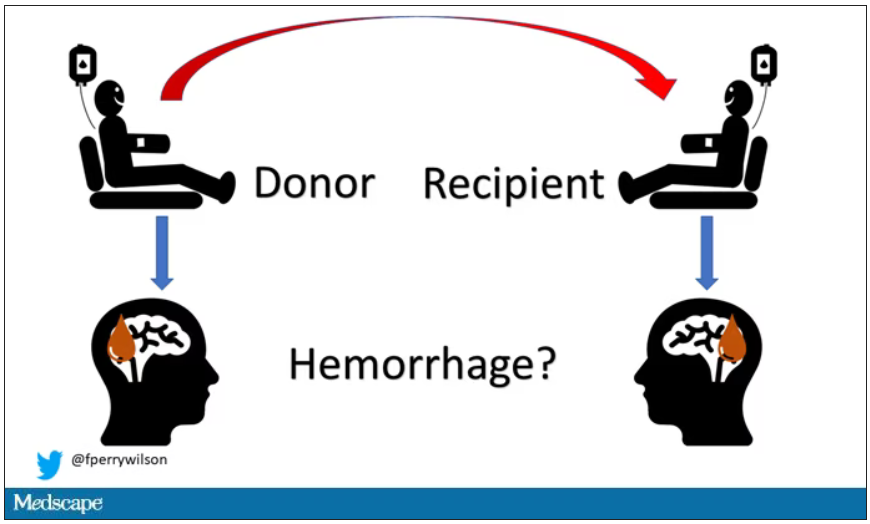
Of course, to really test that hypothesis, you’d need to know who every blood donor in a country was and every person who received that blood and all their subsequent diagnoses for basically their entire lives. No one has that kind of data, right?
Well, if you’ve been watching this space, you’ll know that a few countries do. Enter Sweden and Denmark, with their national electronic health record that captures all of this information, and much more, on every single person who lives or has lived in those countries since before 1970. Unbelievable.
So that’s exactly what the researchers, led by Jingchen Zhao at Karolinska (Sweden) University, did. They identified roughly 760,000 individuals in Sweden and 330,000 people in Denmark who had received a blood transfusion between 1970 and 2017.
Of course, most of those blood donors – 99% of them, actually – never went on to have any bleeding in the brain. It is a rare thing, fortunately.
But some of the donors did, on average within about 5 years of the time they donated blood. The researchers characterized each donor as either never having a brain bleed, having a single bleed, or having multiple bleeds. The latter is most strongly associated with CAA.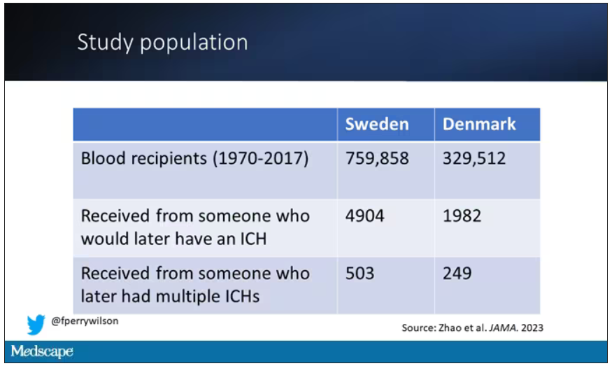
The big question: Would recipients who got blood from individuals who later on had brain bleeds, have brain bleeds themselves?
The answer is yes, though with an asterisk. You can see the results here. The risk of recipients having a brain bleed was lowest if the blood they received was from people who never had a brain bleed, higher if the individual had a single brain bleed, and highest if they got blood from a donor who would go on to have multiple brain bleeds.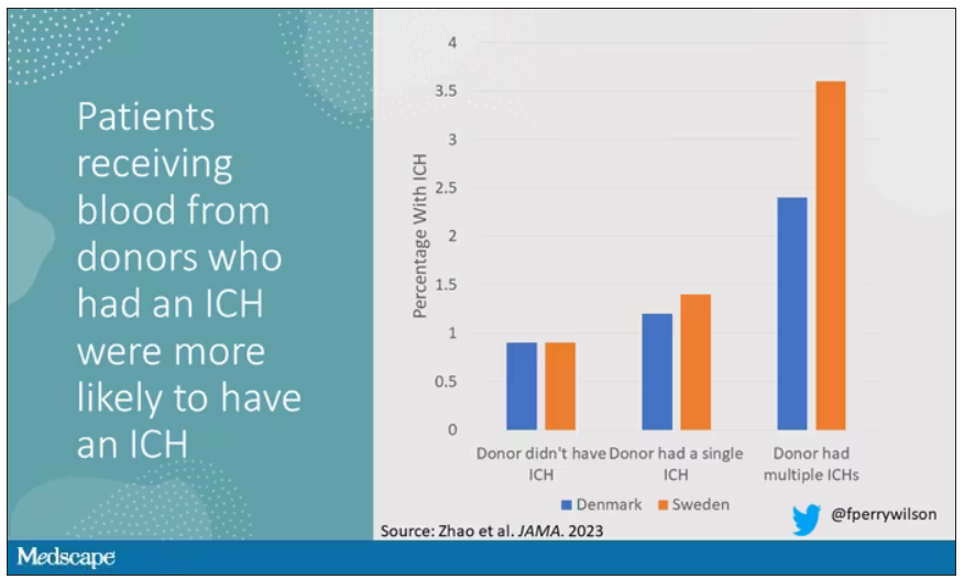
All in all, individuals who received blood from someone who would later have multiple hemorrhages were three times more likely to themselves develop bleeds themselves. It’s fairly compelling evidence of a transmissible agent.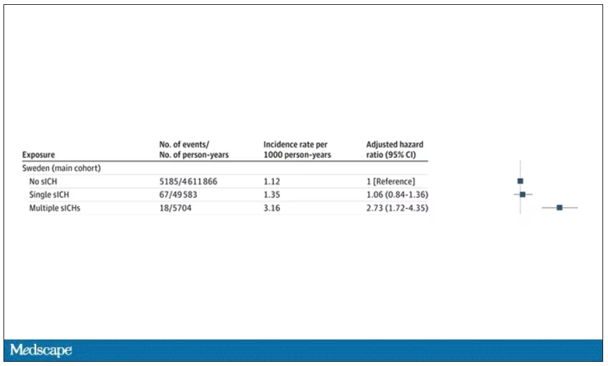
Of course, there are some potential confounders to consider here. Whose blood you get is not totally random. If, for example, people with type O blood are just more likely to have brain bleeds, then you could get results like this, as type O tends to donate to type O and both groups would have higher risk after donation. But the authors adjusted for blood type. They also adjusted for number of transfusions, calendar year, age, sex, and indication for transfusion.
Perhaps most compelling, and most clever, is that they used ischemic stroke as a negative control. Would people who received blood from someone who later had an ischemic stroke themselves be more likely to go on to have an ischemic stroke? No signal at all. It does not appear that there is a transmissible agent associated with ischemic stroke – only the brain bleeds.
I know what you’re thinking. What’s the agent? What’s the microbe, or virus, or prion, or toxin? The study gives us no insight there. These nationwide databases are awesome but they can only do so much. Because of the vagaries of medical coding and the difficulty of making the CAA diagnosis, the authors are using brain bleeds as a proxy here; we don’t even know for sure whether these were CAA-associated brain bleeds.
It’s also worth noting that there’s little we can do about this. None of the blood donors in this study had a brain bleed prior to donation; it’s not like we could screen people out of donating in the future. We have no test for whatever this agent is, if it even exists, nor do we have a potential treatment. Fortunately, whatever it is, it is extremely rare.
Still, this paper feels like a shot across the bow. At this point, the probability has shifted strongly away from CAA being a purely random disease and toward it being an infectious one. It may be time to round up some of the unusual suspects.
Dr. F. Perry Wilson is an associate professor of medicine and public health and director of Yale University’s Clinical and Translational Research Accelerator in New Haven, Conn. He reported no conflicts of interest.
A version of this article first appeared on Medscape.com.
This transcript has been edited for clarity.
How do you tell if a condition is caused by an infection?
It seems like an obvious question, right? In the post–van Leeuwenhoek era we can look at whatever part of the body is diseased under a microscope and see microbes – you know, the usual suspects.
Except when we can’t. And there are plenty of cases where we can’t: where the microbe is too small to be seen without more advanced imaging techniques, like with viruses; or when the pathogen is sparsely populated or hard to culture, like Mycobacterium.
Finding out that a condition is the result of an infection is not only an exercise for 19th century physicians. After all, it was 2008 when Barry Marshall and Robin Warren won their Nobel Prize for proving that stomach ulcers, long thought to be due to “stress,” were actually caused by a tiny microbe called Helicobacter pylori.
And this week, we are looking at a study which, once again, begins to suggest that a condition thought to be more or less random – cerebral amyloid angiopathy – may actually be the result of an infectious disease.
We’re talking about this paper, appearing in JAMA, which is just a great example of old-fashioned shoe-leather epidemiology. But let’s get up to speed on cerebral amyloid angiopathy (CAA) first.
CAA is characterized by the deposition of amyloid protein in the brain. While there are some genetic causes, they are quite rare, and most cases are thought to be idiopathic. Recent analyses suggest that somewhere between 5% and 7% of cognitively normal older adults have CAA, but the rate is much higher among those with intracerebral hemorrhage – brain bleeds. In fact, CAA is the second-most common cause of bleeding in the brain, second only to severe hypertension.
An article in Nature highlights cases that seemed to develop after the administration of cadaveric pituitary hormone.
Other studies have shown potential transmission via dura mater grafts and neurosurgical instruments. But despite those clues, no infectious organism has been identified. Some have suggested that the long latent period and difficulty of finding a responsible microbe points to a prion-like disease not yet known. But these studies are more or less case series. The new JAMA paper gives us, if not a smoking gun, a pretty decent set of fingerprints.
Here’s the idea: If CAA is caused by some infectious agent, it may be transmitted in the blood. We know that a decent percentage of people who have spontaneous brain bleeds have CAA. If those people donated blood in the past, maybe the people who received that blood would be at risk for brain bleeds too.
Of course, to really test that hypothesis, you’d need to know who every blood donor in a country was and every person who received that blood and all their subsequent diagnoses for basically their entire lives. No one has that kind of data, right?
Well, if you’ve been watching this space, you’ll know that a few countries do. Enter Sweden and Denmark, with their national electronic health record that captures all of this information, and much more, on every single person who lives or has lived in those countries since before 1970. Unbelievable.
So that’s exactly what the researchers, led by Jingchen Zhao at Karolinska (Sweden) University, did. They identified roughly 760,000 individuals in Sweden and 330,000 people in Denmark who had received a blood transfusion between 1970 and 2017.
Of course, most of those blood donors – 99% of them, actually – never went on to have any bleeding in the brain. It is a rare thing, fortunately.
But some of the donors did, on average within about 5 years of the time they donated blood. The researchers characterized each donor as either never having a brain bleed, having a single bleed, or having multiple bleeds. The latter is most strongly associated with CAA.
The big question: Would recipients who got blood from individuals who later on had brain bleeds, have brain bleeds themselves?
The answer is yes, though with an asterisk. You can see the results here. The risk of recipients having a brain bleed was lowest if the blood they received was from people who never had a brain bleed, higher if the individual had a single brain bleed, and highest if they got blood from a donor who would go on to have multiple brain bleeds.
All in all, individuals who received blood from someone who would later have multiple hemorrhages were three times more likely to themselves develop bleeds themselves. It’s fairly compelling evidence of a transmissible agent.
Of course, there are some potential confounders to consider here. Whose blood you get is not totally random. If, for example, people with type O blood are just more likely to have brain bleeds, then you could get results like this, as type O tends to donate to type O and both groups would have higher risk after donation. But the authors adjusted for blood type. They also adjusted for number of transfusions, calendar year, age, sex, and indication for transfusion.
Perhaps most compelling, and most clever, is that they used ischemic stroke as a negative control. Would people who received blood from someone who later had an ischemic stroke themselves be more likely to go on to have an ischemic stroke? No signal at all. It does not appear that there is a transmissible agent associated with ischemic stroke – only the brain bleeds.
I know what you’re thinking. What’s the agent? What’s the microbe, or virus, or prion, or toxin? The study gives us no insight there. These nationwide databases are awesome but they can only do so much. Because of the vagaries of medical coding and the difficulty of making the CAA diagnosis, the authors are using brain bleeds as a proxy here; we don’t even know for sure whether these were CAA-associated brain bleeds.
It’s also worth noting that there’s little we can do about this. None of the blood donors in this study had a brain bleed prior to donation; it’s not like we could screen people out of donating in the future. We have no test for whatever this agent is, if it even exists, nor do we have a potential treatment. Fortunately, whatever it is, it is extremely rare.
Still, this paper feels like a shot across the bow. At this point, the probability has shifted strongly away from CAA being a purely random disease and toward it being an infectious one. It may be time to round up some of the unusual suspects.
Dr. F. Perry Wilson is an associate professor of medicine and public health and director of Yale University’s Clinical and Translational Research Accelerator in New Haven, Conn. He reported no conflicts of interest.
A version of this article first appeared on Medscape.com.
This transcript has been edited for clarity.
How do you tell if a condition is caused by an infection?
It seems like an obvious question, right? In the post–van Leeuwenhoek era we can look at whatever part of the body is diseased under a microscope and see microbes – you know, the usual suspects.
Except when we can’t. And there are plenty of cases where we can’t: where the microbe is too small to be seen without more advanced imaging techniques, like with viruses; or when the pathogen is sparsely populated or hard to culture, like Mycobacterium.
Finding out that a condition is the result of an infection is not only an exercise for 19th century physicians. After all, it was 2008 when Barry Marshall and Robin Warren won their Nobel Prize for proving that stomach ulcers, long thought to be due to “stress,” were actually caused by a tiny microbe called Helicobacter pylori.
And this week, we are looking at a study which, once again, begins to suggest that a condition thought to be more or less random – cerebral amyloid angiopathy – may actually be the result of an infectious disease.
We’re talking about this paper, appearing in JAMA, which is just a great example of old-fashioned shoe-leather epidemiology. But let’s get up to speed on cerebral amyloid angiopathy (CAA) first.
CAA is characterized by the deposition of amyloid protein in the brain. While there are some genetic causes, they are quite rare, and most cases are thought to be idiopathic. Recent analyses suggest that somewhere between 5% and 7% of cognitively normal older adults have CAA, but the rate is much higher among those with intracerebral hemorrhage – brain bleeds. In fact, CAA is the second-most common cause of bleeding in the brain, second only to severe hypertension.
An article in Nature highlights cases that seemed to develop after the administration of cadaveric pituitary hormone.
Other studies have shown potential transmission via dura mater grafts and neurosurgical instruments. But despite those clues, no infectious organism has been identified. Some have suggested that the long latent period and difficulty of finding a responsible microbe points to a prion-like disease not yet known. But these studies are more or less case series. The new JAMA paper gives us, if not a smoking gun, a pretty decent set of fingerprints.
Here’s the idea: If CAA is caused by some infectious agent, it may be transmitted in the blood. We know that a decent percentage of people who have spontaneous brain bleeds have CAA. If those people donated blood in the past, maybe the people who received that blood would be at risk for brain bleeds too.
Of course, to really test that hypothesis, you’d need to know who every blood donor in a country was and every person who received that blood and all their subsequent diagnoses for basically their entire lives. No one has that kind of data, right?
Well, if you’ve been watching this space, you’ll know that a few countries do. Enter Sweden and Denmark, with their national electronic health record that captures all of this information, and much more, on every single person who lives or has lived in those countries since before 1970. Unbelievable.
So that’s exactly what the researchers, led by Jingchen Zhao at Karolinska (Sweden) University, did. They identified roughly 760,000 individuals in Sweden and 330,000 people in Denmark who had received a blood transfusion between 1970 and 2017.
Of course, most of those blood donors – 99% of them, actually – never went on to have any bleeding in the brain. It is a rare thing, fortunately.
But some of the donors did, on average within about 5 years of the time they donated blood. The researchers characterized each donor as either never having a brain bleed, having a single bleed, or having multiple bleeds. The latter is most strongly associated with CAA.
The big question: Would recipients who got blood from individuals who later on had brain bleeds, have brain bleeds themselves?
The answer is yes, though with an asterisk. You can see the results here. The risk of recipients having a brain bleed was lowest if the blood they received was from people who never had a brain bleed, higher if the individual had a single brain bleed, and highest if they got blood from a donor who would go on to have multiple brain bleeds.
All in all, individuals who received blood from someone who would later have multiple hemorrhages were three times more likely to themselves develop bleeds themselves. It’s fairly compelling evidence of a transmissible agent.
Of course, there are some potential confounders to consider here. Whose blood you get is not totally random. If, for example, people with type O blood are just more likely to have brain bleeds, then you could get results like this, as type O tends to donate to type O and both groups would have higher risk after donation. But the authors adjusted for blood type. They also adjusted for number of transfusions, calendar year, age, sex, and indication for transfusion.
Perhaps most compelling, and most clever, is that they used ischemic stroke as a negative control. Would people who received blood from someone who later had an ischemic stroke themselves be more likely to go on to have an ischemic stroke? No signal at all. It does not appear that there is a transmissible agent associated with ischemic stroke – only the brain bleeds.
I know what you’re thinking. What’s the agent? What’s the microbe, or virus, or prion, or toxin? The study gives us no insight there. These nationwide databases are awesome but they can only do so much. Because of the vagaries of medical coding and the difficulty of making the CAA diagnosis, the authors are using brain bleeds as a proxy here; we don’t even know for sure whether these were CAA-associated brain bleeds.
It’s also worth noting that there’s little we can do about this. None of the blood donors in this study had a brain bleed prior to donation; it’s not like we could screen people out of donating in the future. We have no test for whatever this agent is, if it even exists, nor do we have a potential treatment. Fortunately, whatever it is, it is extremely rare.
Still, this paper feels like a shot across the bow. At this point, the probability has shifted strongly away from CAA being a purely random disease and toward it being an infectious one. It may be time to round up some of the unusual suspects.
Dr. F. Perry Wilson is an associate professor of medicine and public health and director of Yale University’s Clinical and Translational Research Accelerator in New Haven, Conn. He reported no conflicts of interest.
A version of this article first appeared on Medscape.com.
The new normal in body temperature
This transcript has been edited for clarity.
Every branch of science has its constants. Physics has the speed of light, the gravitational constant, the Planck constant. Chemistry gives us Avogadro’s number, Faraday’s constant, the charge of an electron. Medicine isn’t quite as reliable as physics when it comes to these things, but insofar as there are any constants in medicine, might I suggest normal body temperature: 37° Celsius, 98.6° Fahrenheit.
Sure, serum sodium may be less variable and lactate concentration more clinically relevant, but even my 7-year-old knows that normal body temperature is 98.6°.
Except, as it turns out, 98.6° isn’t normal at all.
How did we arrive at 37.0° C for normal body temperature? We got it from this guy – German physician Carl Reinhold August Wunderlich, who, in addition to looking eerily like Luciano Pavarotti, was the first to realize that fever was not itself a disease but a symptom of one.
In 1851, Dr. Wunderlich released his measurements of more than 1 million body temperatures taken from 25,000 Germans – a painstaking process at the time, which employed a foot-long thermometer and took 20 minutes to obtain a measurement.
The average temperature measured, of course, was 37° C.
We’re more than 150 years post-Wunderlich right now, and the average person in the United States might be quite a bit different from the average German in 1850. Moreover, we can do a lot better than just measuring a ton of people and taking the average, because we have statistics. The problem with measuring a bunch of people and taking the average temperature as normal is that you can’t be sure that the people you are measuring are normal. There are obvious causes of elevated temperature that you could exclude. Let’s not take people with a respiratory infection or who are taking Tylenol, for example. But as highlighted in this paper in JAMA Internal Medicine, we can do a lot better than that.
The study leverages the fact that body temperature is typically measured during all medical office visits and recorded in the ever-present electronic medical record.
Researchers from Stanford identified 724,199 patient encounters with outpatient temperature data. They excluded extreme temperatures – less than 34° C or greater than 40° C – excluded patients under 20 or above 80 years, and excluded those with extremes of height, weight, or body mass index.
You end up with a distribution like this. Note that the peak is clearly lower than 37° C.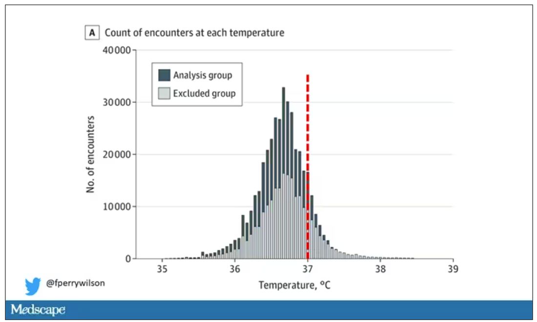
But we’re still not at “normal.” Some people would be seeing their doctor for conditions that affect body temperature, such as infection. You could use diagnosis codes to flag these individuals and drop them, but that feels a bit arbitrary.
I really love how the researchers used data to fix this problem. They used a technique called LIMIT (Laboratory Information Mining for Individualized Thresholds). It works like this:
Take all the temperature measurements and then identify the outliers – the very tails of the distribution.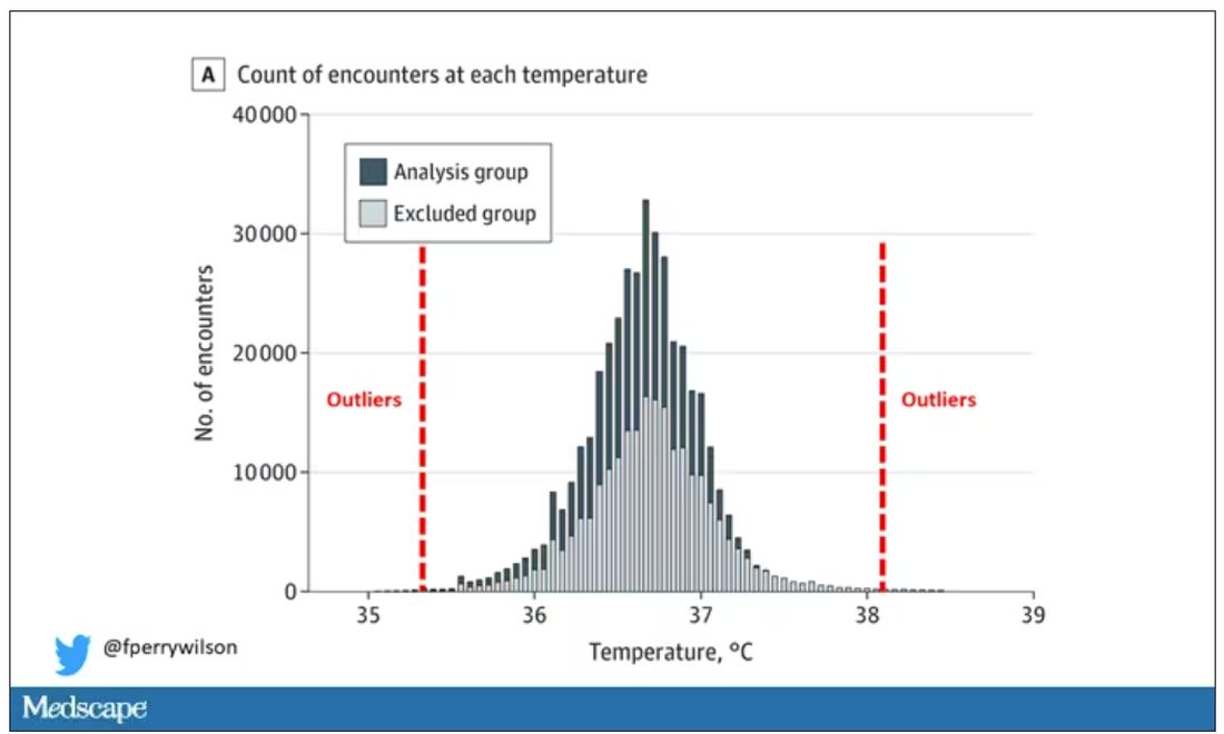
Look at all the diagnosis codes in those distributions. Determine which diagnosis codes are overrepresented in those distributions. Now you have a data-driven way to say that yes, these diagnoses are associated with weird temperatures. Next, eliminate everyone with those diagnoses from the dataset. What you are left with is a normal population, or at least a population that doesn’t have a condition that seems to meaningfully affect temperature.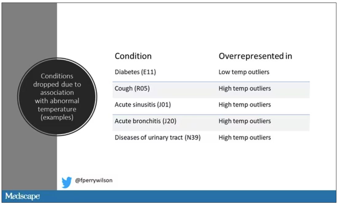
So, who was dropped? Well, a lot of people, actually. It turned out that diabetes was way overrepresented in the outlier group. Although 9.2% of the population had diabetes, 26% of people with very low temperatures did, so everyone with diabetes is removed from the dataset. While 5% of the population had a cough at their encounter, 7% of the people with very high temperature and 7% of the people with very low temperature had a cough, so everyone with cough gets thrown out.
The algorithm excluded people on antibiotics or who had sinusitis, urinary tract infections, pneumonia, and, yes, a diagnosis of “fever.” The list makes sense, which is always nice when you have a purely algorithmic classification system.
What do we have left? What is the real normal temperature? Ready?
It’s 36.64° C, or about 98.0° F.
Of course, normal temperature varied depending on the time of day it was measured – higher in the afternoon.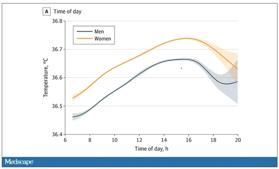
The normal temperature in women tended to be higher than in men. The normal temperature declined with age as well.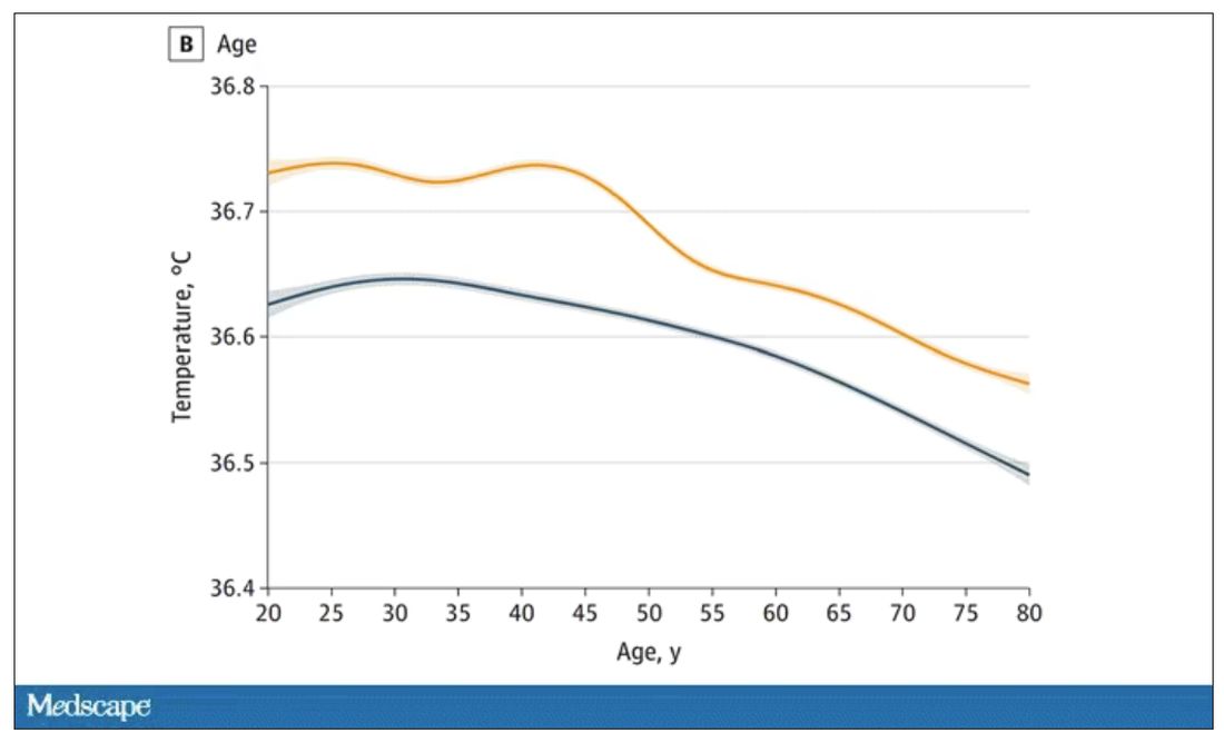
In fact, the researchers built a nice online calculator where you can enter your own, or your patient’s, parameters and calculate a normal body temperature for them. Here’s mine. My normal temperature at around 2 p.m. should be 36.7° C.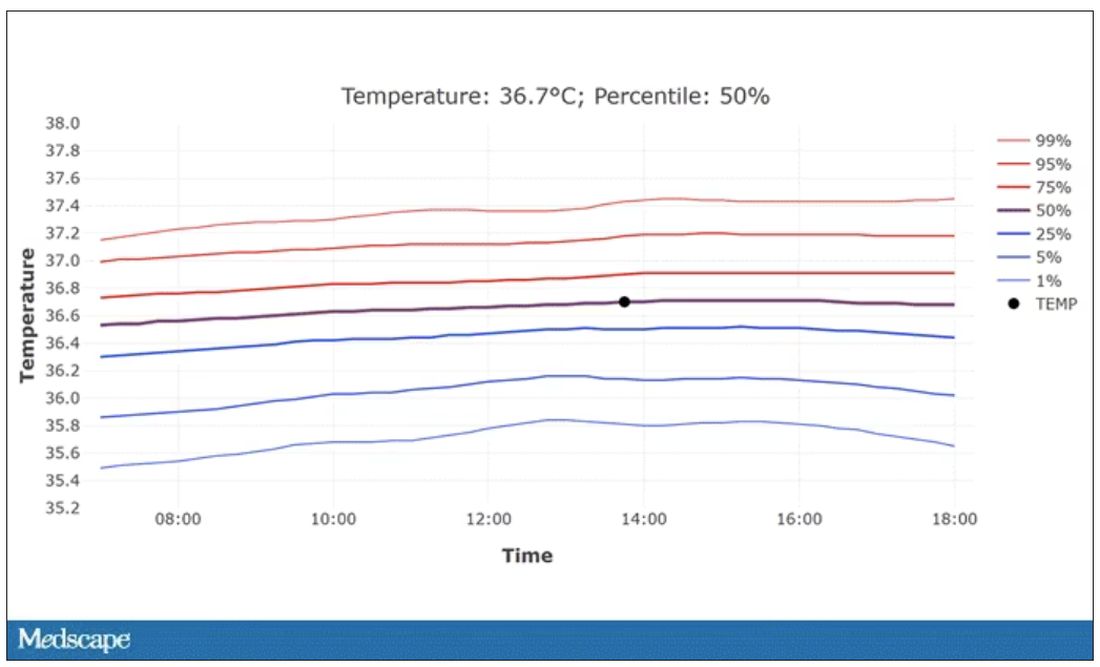
So, we’re all more cold-blooded than we thought. Is this just because of better methods? Maybe. But studies have actually shown that body temperature may be decreasing over time in humans, possibly because of the lower levels of inflammation we face in modern life (thanks to improvements in hygiene and antibiotics).
Of course, I’m sure some of you are asking yourselves whether any of this really matters. Is 37° C close enough?
Sure, this may be sort of puttering around the edges of physical diagnosis, but I think the methodology is really interesting and can obviously be applied to other broadly collected data points. But these data show us that thin, older individuals really do run cooler, and that we may need to pay more attention to a low-grade fever in that population than we otherwise would.
In any case, it’s time for a little re-education. If someone asks you what normal body temperature is, just say 36.6° C, 98.0° F. For his work in this area, I suggest we call it Wunderlich’s constant.
Dr. Wilson is associate professor of medicine and public health at Yale University, New Haven, Conn., and director of Yale’s Clinical and Translational Research Accelerator. He has no disclosures.
A version of this article appeared on Medscape.com.
This transcript has been edited for clarity.
Every branch of science has its constants. Physics has the speed of light, the gravitational constant, the Planck constant. Chemistry gives us Avogadro’s number, Faraday’s constant, the charge of an electron. Medicine isn’t quite as reliable as physics when it comes to these things, but insofar as there are any constants in medicine, might I suggest normal body temperature: 37° Celsius, 98.6° Fahrenheit.
Sure, serum sodium may be less variable and lactate concentration more clinically relevant, but even my 7-year-old knows that normal body temperature is 98.6°.
Except, as it turns out, 98.6° isn’t normal at all.
How did we arrive at 37.0° C for normal body temperature? We got it from this guy – German physician Carl Reinhold August Wunderlich, who, in addition to looking eerily like Luciano Pavarotti, was the first to realize that fever was not itself a disease but a symptom of one.
In 1851, Dr. Wunderlich released his measurements of more than 1 million body temperatures taken from 25,000 Germans – a painstaking process at the time, which employed a foot-long thermometer and took 20 minutes to obtain a measurement.
The average temperature measured, of course, was 37° C.
We’re more than 150 years post-Wunderlich right now, and the average person in the United States might be quite a bit different from the average German in 1850. Moreover, we can do a lot better than just measuring a ton of people and taking the average, because we have statistics. The problem with measuring a bunch of people and taking the average temperature as normal is that you can’t be sure that the people you are measuring are normal. There are obvious causes of elevated temperature that you could exclude. Let’s not take people with a respiratory infection or who are taking Tylenol, for example. But as highlighted in this paper in JAMA Internal Medicine, we can do a lot better than that.
The study leverages the fact that body temperature is typically measured during all medical office visits and recorded in the ever-present electronic medical record.
Researchers from Stanford identified 724,199 patient encounters with outpatient temperature data. They excluded extreme temperatures – less than 34° C or greater than 40° C – excluded patients under 20 or above 80 years, and excluded those with extremes of height, weight, or body mass index.
You end up with a distribution like this. Note that the peak is clearly lower than 37° C.
But we’re still not at “normal.” Some people would be seeing their doctor for conditions that affect body temperature, such as infection. You could use diagnosis codes to flag these individuals and drop them, but that feels a bit arbitrary.
I really love how the researchers used data to fix this problem. They used a technique called LIMIT (Laboratory Information Mining for Individualized Thresholds). It works like this:
Take all the temperature measurements and then identify the outliers – the very tails of the distribution.
Look at all the diagnosis codes in those distributions. Determine which diagnosis codes are overrepresented in those distributions. Now you have a data-driven way to say that yes, these diagnoses are associated with weird temperatures. Next, eliminate everyone with those diagnoses from the dataset. What you are left with is a normal population, or at least a population that doesn’t have a condition that seems to meaningfully affect temperature.
So, who was dropped? Well, a lot of people, actually. It turned out that diabetes was way overrepresented in the outlier group. Although 9.2% of the population had diabetes, 26% of people with very low temperatures did, so everyone with diabetes is removed from the dataset. While 5% of the population had a cough at their encounter, 7% of the people with very high temperature and 7% of the people with very low temperature had a cough, so everyone with cough gets thrown out.
The algorithm excluded people on antibiotics or who had sinusitis, urinary tract infections, pneumonia, and, yes, a diagnosis of “fever.” The list makes sense, which is always nice when you have a purely algorithmic classification system.
What do we have left? What is the real normal temperature? Ready?
It’s 36.64° C, or about 98.0° F.
Of course, normal temperature varied depending on the time of day it was measured – higher in the afternoon.
The normal temperature in women tended to be higher than in men. The normal temperature declined with age as well.
In fact, the researchers built a nice online calculator where you can enter your own, or your patient’s, parameters and calculate a normal body temperature for them. Here’s mine. My normal temperature at around 2 p.m. should be 36.7° C.
So, we’re all more cold-blooded than we thought. Is this just because of better methods? Maybe. But studies have actually shown that body temperature may be decreasing over time in humans, possibly because of the lower levels of inflammation we face in modern life (thanks to improvements in hygiene and antibiotics).
Of course, I’m sure some of you are asking yourselves whether any of this really matters. Is 37° C close enough?
Sure, this may be sort of puttering around the edges of physical diagnosis, but I think the methodology is really interesting and can obviously be applied to other broadly collected data points. But these data show us that thin, older individuals really do run cooler, and that we may need to pay more attention to a low-grade fever in that population than we otherwise would.
In any case, it’s time for a little re-education. If someone asks you what normal body temperature is, just say 36.6° C, 98.0° F. For his work in this area, I suggest we call it Wunderlich’s constant.
Dr. Wilson is associate professor of medicine and public health at Yale University, New Haven, Conn., and director of Yale’s Clinical and Translational Research Accelerator. He has no disclosures.
A version of this article appeared on Medscape.com.
This transcript has been edited for clarity.
Every branch of science has its constants. Physics has the speed of light, the gravitational constant, the Planck constant. Chemistry gives us Avogadro’s number, Faraday’s constant, the charge of an electron. Medicine isn’t quite as reliable as physics when it comes to these things, but insofar as there are any constants in medicine, might I suggest normal body temperature: 37° Celsius, 98.6° Fahrenheit.
Sure, serum sodium may be less variable and lactate concentration more clinically relevant, but even my 7-year-old knows that normal body temperature is 98.6°.
Except, as it turns out, 98.6° isn’t normal at all.
How did we arrive at 37.0° C for normal body temperature? We got it from this guy – German physician Carl Reinhold August Wunderlich, who, in addition to looking eerily like Luciano Pavarotti, was the first to realize that fever was not itself a disease but a symptom of one.
In 1851, Dr. Wunderlich released his measurements of more than 1 million body temperatures taken from 25,000 Germans – a painstaking process at the time, which employed a foot-long thermometer and took 20 minutes to obtain a measurement.
The average temperature measured, of course, was 37° C.
We’re more than 150 years post-Wunderlich right now, and the average person in the United States might be quite a bit different from the average German in 1850. Moreover, we can do a lot better than just measuring a ton of people and taking the average, because we have statistics. The problem with measuring a bunch of people and taking the average temperature as normal is that you can’t be sure that the people you are measuring are normal. There are obvious causes of elevated temperature that you could exclude. Let’s not take people with a respiratory infection or who are taking Tylenol, for example. But as highlighted in this paper in JAMA Internal Medicine, we can do a lot better than that.
The study leverages the fact that body temperature is typically measured during all medical office visits and recorded in the ever-present electronic medical record.
Researchers from Stanford identified 724,199 patient encounters with outpatient temperature data. They excluded extreme temperatures – less than 34° C or greater than 40° C – excluded patients under 20 or above 80 years, and excluded those with extremes of height, weight, or body mass index.
You end up with a distribution like this. Note that the peak is clearly lower than 37° C.
But we’re still not at “normal.” Some people would be seeing their doctor for conditions that affect body temperature, such as infection. You could use diagnosis codes to flag these individuals and drop them, but that feels a bit arbitrary.
I really love how the researchers used data to fix this problem. They used a technique called LIMIT (Laboratory Information Mining for Individualized Thresholds). It works like this:
Take all the temperature measurements and then identify the outliers – the very tails of the distribution.
Look at all the diagnosis codes in those distributions. Determine which diagnosis codes are overrepresented in those distributions. Now you have a data-driven way to say that yes, these diagnoses are associated with weird temperatures. Next, eliminate everyone with those diagnoses from the dataset. What you are left with is a normal population, or at least a population that doesn’t have a condition that seems to meaningfully affect temperature.
So, who was dropped? Well, a lot of people, actually. It turned out that diabetes was way overrepresented in the outlier group. Although 9.2% of the population had diabetes, 26% of people with very low temperatures did, so everyone with diabetes is removed from the dataset. While 5% of the population had a cough at their encounter, 7% of the people with very high temperature and 7% of the people with very low temperature had a cough, so everyone with cough gets thrown out.
The algorithm excluded people on antibiotics or who had sinusitis, urinary tract infections, pneumonia, and, yes, a diagnosis of “fever.” The list makes sense, which is always nice when you have a purely algorithmic classification system.
What do we have left? What is the real normal temperature? Ready?
It’s 36.64° C, or about 98.0° F.
Of course, normal temperature varied depending on the time of day it was measured – higher in the afternoon.
The normal temperature in women tended to be higher than in men. The normal temperature declined with age as well.
In fact, the researchers built a nice online calculator where you can enter your own, or your patient’s, parameters and calculate a normal body temperature for them. Here’s mine. My normal temperature at around 2 p.m. should be 36.7° C.
So, we’re all more cold-blooded than we thought. Is this just because of better methods? Maybe. But studies have actually shown that body temperature may be decreasing over time in humans, possibly because of the lower levels of inflammation we face in modern life (thanks to improvements in hygiene and antibiotics).
Of course, I’m sure some of you are asking yourselves whether any of this really matters. Is 37° C close enough?
Sure, this may be sort of puttering around the edges of physical diagnosis, but I think the methodology is really interesting and can obviously be applied to other broadly collected data points. But these data show us that thin, older individuals really do run cooler, and that we may need to pay more attention to a low-grade fever in that population than we otherwise would.
In any case, it’s time for a little re-education. If someone asks you what normal body temperature is, just say 36.6° C, 98.0° F. For his work in this area, I suggest we call it Wunderlich’s constant.
Dr. Wilson is associate professor of medicine and public health at Yale University, New Haven, Conn., and director of Yale’s Clinical and Translational Research Accelerator. He has no disclosures.
A version of this article appeared on Medscape.com.
‘Decapitated’ boy saved by surgery team
This transcript has been edited for clarity.
F. Perry Wilson, MD, MSCE: I am joined today by Dr. Ohad Einav. He’s a staff surgeon in orthopedics at Hadassah Medical Center in Jerusalem. He’s with me to talk about an absolutely incredible surgical case, something that is terrifying to most non–orthopedic surgeons and I imagine is fairly scary for spine surgeons like him as well. But what we don’t have is information about how this works from a medical perspective. So, first of all, Dr. Einav, thank you for taking time to speak with me today.
Ohad Einav, MD: Thank you for having me.
Dr. Wilson: Can you tell us about Suleiman Hassan and what happened to him before he came into your care?
Dr. Einav: Hassan is a 12-year-old child who was riding his bicycle on the West Bank, about 40 minutes from here. Unfortunately, he was involved in a motor vehicle accident and he suffered injuries to his abdomen and cervical spine. He was transported to our service by helicopter from the scene of the accident.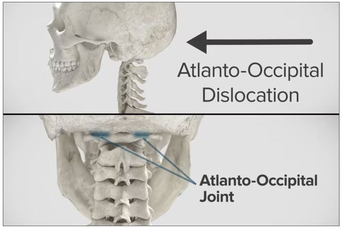
Dr. Wilson: “Injury to the cervical spine” might be something of an understatement. He had what’s called atlanto-occipital dislocation, colloquially often referred to as internal decapitation. Can you tell us what that means? It sounds terrifying.
Dr. Einav: It’s an injury to the ligaments between the occiput and the upper cervical spine, with or without bony fracture. The atlanto-occipital joint is formed by the superior articular facet of the atlas and the occipital condyle, stabilized by an articular capsule between the head and neck, and is supported by various ligaments around it that stabilize the joint and allow joint movements, including flexion, extension, and some rotation in the lower levels.
Dr. Wilson: This joint has several degrees of freedom, which means it needs a lot of support. With this type of injury, where essentially you have severing of the ligaments, is it usually survivable? How dangerous is this?
Dr. Einav: The mortality rate is 50%-60%, depending on the primary impact, the injury, transportation later on, and then the surgery and surgical management.
Dr. Wilson: Tell us a bit about this patient’s status when he came to your medical center. I assume he was in bad shape.
Dr. Einav: Hassan arrived at our medical center with a Glasgow Coma Scale score of 15. He was fully conscious. He was hemodynamically stable except for a bad laceration on his abdomen. He had a Philadelphia collar around his neck. He was transported by chopper because the paramedics suspected that he had a cervical spine injury and decided to bring him to a Level 1 trauma center.
He was monitored and we treated him according to the ATLS [advanced trauma life support] protocol. He didn’t have any gross sensory deficits, but he was a little confused about the whole situation and the accident. Therefore, we could do a general examination but we couldn’t rely on that regarding any sensory deficit that he may or may not have. We decided as a team that it would be better to slow down and control the situation. We decided not to operate on him immediately. We basically stabilized him and made sure that he didn’t have any traumatic internal organ damage. Later on we took him to the OR and performed surgery.
Dr. Wilson: It’s amazing that he had intact motor function, considering the extent of his injury. The spinal cord was spared somewhat during the injury. There must have been a moment when you realized that this kid, who was conscious and could move all four extremities, had a very severe neck injury. Was that due to a CT scan or physical exam? And what was your feeling when you saw that he had atlanto-occipital dislocation?
Dr. Einav: As a surgeon, you have a gut feeling in regard to the general examination of the patient. But I never rely on gut feelings. On the CT, I understood exactly what he had, what we needed to do, and the time frame.
Dr. Wilson: You’ve done these types of surgeries before, right? Obviously, no one has done a lot of them because this isn’t very common. But you knew what to do. Did you have a plan? Where does your experience come into play in a situation like this?
Dr. Einav: I graduated from the spine program of Toronto University, where I did a fellowship in trauma of the spine and complex spine surgery. I had very good teachers, and during my fellowship I treated a few cases in older patients that were similar but not the same. Therefore, I knew exactly what needed to be done.
Dr. Wilson: For those of us who aren’t surgeons, take us into the OR with you. This is obviously an incredibly delicate procedure. You are high up in the spinal cord at the base of the brain. The slightest mistake could have devastating consequences. What are the key elements of this procedure? What can go wrong here? What is the number-one thing you have to look out for when you’re trying to fix an internal decapitation?
Dr. Einav: The key element in surgeries of the cervical spine – trauma and complex spine surgery – is planning. I never go to the OR without knowing what I’m going to do. I have a few plans – plan A, plan B, plan C – in case something fails. So, I definitely know what the next step will be. I always think about the surgery a few hours before, if I have time to prepare.
The second thing that is very important is teamwork. The team needs to be coordinated. Everybody needs to know what their job is. With these types of injuries, it’s not the time for rookies. If you are new, please stand back and let the more experienced people do that job. I’m talking about surgeons, nurses, anesthesiologists – everyone.
Another important thing in planning is choosing the right hardware. For example, in this case we had a problem because most of the hardware is designed for adults, and we had to improvise because there isn’t a lot of hardware on the market for the pediatric population. The adult plates and screws are too big, so we had to improvise.
Dr. Wilson: Tell us more about that. How do you improvise spinal hardware for a 12-year-old?
Dr. Einav: In this case, I chose to use hardware from one of the companies that works with us.
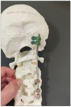
You can see in this model the area of the injury, and the area that we worked on. To perform the surgery, I had to use some plates and rods from a different company. This company’s (NuVasive) hardware has a small attachment to the skull, which was helpful for affixing the skull to the cervical spine, instead of using a big plate that would sit at the base of the skull and would not be very good for him. Most of the hardware is made for adults and not for kids.
Dr. Wilson: Will that hardware preserve the motor function of his neck? Will he be able to turn his head and extend and flex it?
Dr. Einav: The injury leads to instability and destruction of both articulations between the head and neck. Therefore, those articulations won’t be able to function the same way in the future. There is a decrease of something like 50% of the flexion and extension of Hassan’s cervical spine. Therefore, I decided that in this case there would be no chance of saving Hassan’s motor function unless we performed a fusion between the head and the neck, and therefore I decided that this would be the best procedure with the best survival rate. So, in the future, he will have some diminished flexion, extension, and rotation of his head.
Dr. Wilson: How long did his surgery take?
Dr. Einav: To be honest, I don’t remember. But I can tell you that it took us time. It was very challenging to coordinate with everyone. The most problematic part of the surgery to perform is what we call “flip-over.”
The anesthesiologist intubated the patient when he was supine, and later on, we flipped him prone to operate on the spine. This maneuver can actually lead to injury by itself, and injury at this level is fatal. So, we took our time and got Hassan into the OR. The anesthesiologist did a great job with the GlideScope – inserting the endotracheal tube. Later on, we neuromonitored him. Basically, we connected Hassan’s peripheral nerves to a computer and monitored his motor function. Gently we flipped him over, and after that we saw a little change in his motor function, so we had to modify his position so we could preserve his motor function. We then started the procedure, which took a few hours. I don’t know exactly how many.
Dr. Wilson: That just speaks to how delicate this is for everything from the intubation, where typically you’re manipulating the head, to the repositioning. Clearly this requires a lot of teamwork.
What happened after the operation? How is he doing?
Dr. Einav: After the operation, Hassan had a great recovery. He’s doing well. He doesn’t have any motor or sensory deficits. He’s able to ambulate without any aid. He had no signs of infection, which can happen after a car accident, neither from his abdominal wound nor from the occipital cervical surgery. He feels well. We saw him in the clinic. We removed his collar. We monitored him at the clinic. He looked amazing.
Dr. Wilson: That’s incredible. Are there long-term risks for him that you need to be looking out for?
Dr. Einav: Yes, and that’s the reason that we are monitoring him post surgery. While he was in the hospital, we monitored his motor and sensory functions, as well as his wound healing. Later on, in the clinic, for a few weeks after surgery we monitored for any failure of the hardware and bone graft. We check for healing of the bone graft and bone substitutes we put in to heal those bones.
Dr. Wilson: He will grow, right? He’s only 12, so he still has some years of growth in him. Is he going to need more surgery or any kind of hardware upgrade?
Dr. Einav: I hope not. In my surgeries, I never rely on the hardware for long durations. If I decide to do, for example, fusion, I rely on the hardware for a certain amount of time. And then I plan that the biology will do the work. If I plan for fusion, I put bone grafts in the preferred area for a fusion. Then if the hardware fails, I wouldn’t need to take out the hardware, and there would be no change in the condition of the patient.
Dr. Wilson: What an incredible story. It’s clear that you and your team kept your cool despite a very high-acuity situation with a ton of risk. What a tremendous outcome that this boy is not only alive but fully functional. So, congratulations to you and your team. That was very strong work.
Dr. Einav: Thank you very much. I would like to thank our team. We have to remember that the surgeon is not standing alone in the war. Hassan’s story is a success story of a very big group of people from various backgrounds and religions. They work day and night to help people and save lives. To the paramedics, the physiologists, the traumatologists, the pediatricians, the nurses, the physiotherapists, and obviously the surgeons, a big thank you. His story is our success story.
Dr. Wilson: It’s inspiring to see so many people come together to do what we all are here for, which is to fight against suffering, disease, and death. Thank you for keeping up that fight. And thank you for joining me here.
Dr. Einav: Thank you very much.
A version of this article first appeared on Medscape.com.
This transcript has been edited for clarity.
F. Perry Wilson, MD, MSCE: I am joined today by Dr. Ohad Einav. He’s a staff surgeon in orthopedics at Hadassah Medical Center in Jerusalem. He’s with me to talk about an absolutely incredible surgical case, something that is terrifying to most non–orthopedic surgeons and I imagine is fairly scary for spine surgeons like him as well. But what we don’t have is information about how this works from a medical perspective. So, first of all, Dr. Einav, thank you for taking time to speak with me today.
Ohad Einav, MD: Thank you for having me.
Dr. Wilson: Can you tell us about Suleiman Hassan and what happened to him before he came into your care?
Dr. Einav: Hassan is a 12-year-old child who was riding his bicycle on the West Bank, about 40 minutes from here. Unfortunately, he was involved in a motor vehicle accident and he suffered injuries to his abdomen and cervical spine. He was transported to our service by helicopter from the scene of the accident.
Dr. Wilson: “Injury to the cervical spine” might be something of an understatement. He had what’s called atlanto-occipital dislocation, colloquially often referred to as internal decapitation. Can you tell us what that means? It sounds terrifying.
Dr. Einav: It’s an injury to the ligaments between the occiput and the upper cervical spine, with or without bony fracture. The atlanto-occipital joint is formed by the superior articular facet of the atlas and the occipital condyle, stabilized by an articular capsule between the head and neck, and is supported by various ligaments around it that stabilize the joint and allow joint movements, including flexion, extension, and some rotation in the lower levels.
Dr. Wilson: This joint has several degrees of freedom, which means it needs a lot of support. With this type of injury, where essentially you have severing of the ligaments, is it usually survivable? How dangerous is this?
Dr. Einav: The mortality rate is 50%-60%, depending on the primary impact, the injury, transportation later on, and then the surgery and surgical management.
Dr. Wilson: Tell us a bit about this patient’s status when he came to your medical center. I assume he was in bad shape.
Dr. Einav: Hassan arrived at our medical center with a Glasgow Coma Scale score of 15. He was fully conscious. He was hemodynamically stable except for a bad laceration on his abdomen. He had a Philadelphia collar around his neck. He was transported by chopper because the paramedics suspected that he had a cervical spine injury and decided to bring him to a Level 1 trauma center.
He was monitored and we treated him according to the ATLS [advanced trauma life support] protocol. He didn’t have any gross sensory deficits, but he was a little confused about the whole situation and the accident. Therefore, we could do a general examination but we couldn’t rely on that regarding any sensory deficit that he may or may not have. We decided as a team that it would be better to slow down and control the situation. We decided not to operate on him immediately. We basically stabilized him and made sure that he didn’t have any traumatic internal organ damage. Later on we took him to the OR and performed surgery.
Dr. Wilson: It’s amazing that he had intact motor function, considering the extent of his injury. The spinal cord was spared somewhat during the injury. There must have been a moment when you realized that this kid, who was conscious and could move all four extremities, had a very severe neck injury. Was that due to a CT scan or physical exam? And what was your feeling when you saw that he had atlanto-occipital dislocation?
Dr. Einav: As a surgeon, you have a gut feeling in regard to the general examination of the patient. But I never rely on gut feelings. On the CT, I understood exactly what he had, what we needed to do, and the time frame.
Dr. Wilson: You’ve done these types of surgeries before, right? Obviously, no one has done a lot of them because this isn’t very common. But you knew what to do. Did you have a plan? Where does your experience come into play in a situation like this?
Dr. Einav: I graduated from the spine program of Toronto University, where I did a fellowship in trauma of the spine and complex spine surgery. I had very good teachers, and during my fellowship I treated a few cases in older patients that were similar but not the same. Therefore, I knew exactly what needed to be done.
Dr. Wilson: For those of us who aren’t surgeons, take us into the OR with you. This is obviously an incredibly delicate procedure. You are high up in the spinal cord at the base of the brain. The slightest mistake could have devastating consequences. What are the key elements of this procedure? What can go wrong here? What is the number-one thing you have to look out for when you’re trying to fix an internal decapitation?
Dr. Einav: The key element in surgeries of the cervical spine – trauma and complex spine surgery – is planning. I never go to the OR without knowing what I’m going to do. I have a few plans – plan A, plan B, plan C – in case something fails. So, I definitely know what the next step will be. I always think about the surgery a few hours before, if I have time to prepare.
The second thing that is very important is teamwork. The team needs to be coordinated. Everybody needs to know what their job is. With these types of injuries, it’s not the time for rookies. If you are new, please stand back and let the more experienced people do that job. I’m talking about surgeons, nurses, anesthesiologists – everyone.
Another important thing in planning is choosing the right hardware. For example, in this case we had a problem because most of the hardware is designed for adults, and we had to improvise because there isn’t a lot of hardware on the market for the pediatric population. The adult plates and screws are too big, so we had to improvise.
Dr. Wilson: Tell us more about that. How do you improvise spinal hardware for a 12-year-old?
Dr. Einav: In this case, I chose to use hardware from one of the companies that works with us.
You can see in this model the area of the injury, and the area that we worked on. To perform the surgery, I had to use some plates and rods from a different company. This company’s (NuVasive) hardware has a small attachment to the skull, which was helpful for affixing the skull to the cervical spine, instead of using a big plate that would sit at the base of the skull and would not be very good for him. Most of the hardware is made for adults and not for kids.
Dr. Wilson: Will that hardware preserve the motor function of his neck? Will he be able to turn his head and extend and flex it?
Dr. Einav: The injury leads to instability and destruction of both articulations between the head and neck. Therefore, those articulations won’t be able to function the same way in the future. There is a decrease of something like 50% of the flexion and extension of Hassan’s cervical spine. Therefore, I decided that in this case there would be no chance of saving Hassan’s motor function unless we performed a fusion between the head and the neck, and therefore I decided that this would be the best procedure with the best survival rate. So, in the future, he will have some diminished flexion, extension, and rotation of his head.
Dr. Wilson: How long did his surgery take?
Dr. Einav: To be honest, I don’t remember. But I can tell you that it took us time. It was very challenging to coordinate with everyone. The most problematic part of the surgery to perform is what we call “flip-over.”
The anesthesiologist intubated the patient when he was supine, and later on, we flipped him prone to operate on the spine. This maneuver can actually lead to injury by itself, and injury at this level is fatal. So, we took our time and got Hassan into the OR. The anesthesiologist did a great job with the GlideScope – inserting the endotracheal tube. Later on, we neuromonitored him. Basically, we connected Hassan’s peripheral nerves to a computer and monitored his motor function. Gently we flipped him over, and after that we saw a little change in his motor function, so we had to modify his position so we could preserve his motor function. We then started the procedure, which took a few hours. I don’t know exactly how many.
Dr. Wilson: That just speaks to how delicate this is for everything from the intubation, where typically you’re manipulating the head, to the repositioning. Clearly this requires a lot of teamwork.
What happened after the operation? How is he doing?
Dr. Einav: After the operation, Hassan had a great recovery. He’s doing well. He doesn’t have any motor or sensory deficits. He’s able to ambulate without any aid. He had no signs of infection, which can happen after a car accident, neither from his abdominal wound nor from the occipital cervical surgery. He feels well. We saw him in the clinic. We removed his collar. We monitored him at the clinic. He looked amazing.
Dr. Wilson: That’s incredible. Are there long-term risks for him that you need to be looking out for?
Dr. Einav: Yes, and that’s the reason that we are monitoring him post surgery. While he was in the hospital, we monitored his motor and sensory functions, as well as his wound healing. Later on, in the clinic, for a few weeks after surgery we monitored for any failure of the hardware and bone graft. We check for healing of the bone graft and bone substitutes we put in to heal those bones.
Dr. Wilson: He will grow, right? He’s only 12, so he still has some years of growth in him. Is he going to need more surgery or any kind of hardware upgrade?
Dr. Einav: I hope not. In my surgeries, I never rely on the hardware for long durations. If I decide to do, for example, fusion, I rely on the hardware for a certain amount of time. And then I plan that the biology will do the work. If I plan for fusion, I put bone grafts in the preferred area for a fusion. Then if the hardware fails, I wouldn’t need to take out the hardware, and there would be no change in the condition of the patient.
Dr. Wilson: What an incredible story. It’s clear that you and your team kept your cool despite a very high-acuity situation with a ton of risk. What a tremendous outcome that this boy is not only alive but fully functional. So, congratulations to you and your team. That was very strong work.
Dr. Einav: Thank you very much. I would like to thank our team. We have to remember that the surgeon is not standing alone in the war. Hassan’s story is a success story of a very big group of people from various backgrounds and religions. They work day and night to help people and save lives. To the paramedics, the physiologists, the traumatologists, the pediatricians, the nurses, the physiotherapists, and obviously the surgeons, a big thank you. His story is our success story.
Dr. Wilson: It’s inspiring to see so many people come together to do what we all are here for, which is to fight against suffering, disease, and death. Thank you for keeping up that fight. And thank you for joining me here.
Dr. Einav: Thank you very much.
A version of this article first appeared on Medscape.com.
This transcript has been edited for clarity.
F. Perry Wilson, MD, MSCE: I am joined today by Dr. Ohad Einav. He’s a staff surgeon in orthopedics at Hadassah Medical Center in Jerusalem. He’s with me to talk about an absolutely incredible surgical case, something that is terrifying to most non–orthopedic surgeons and I imagine is fairly scary for spine surgeons like him as well. But what we don’t have is information about how this works from a medical perspective. So, first of all, Dr. Einav, thank you for taking time to speak with me today.
Ohad Einav, MD: Thank you for having me.
Dr. Wilson: Can you tell us about Suleiman Hassan and what happened to him before he came into your care?
Dr. Einav: Hassan is a 12-year-old child who was riding his bicycle on the West Bank, about 40 minutes from here. Unfortunately, he was involved in a motor vehicle accident and he suffered injuries to his abdomen and cervical spine. He was transported to our service by helicopter from the scene of the accident.
Dr. Wilson: “Injury to the cervical spine” might be something of an understatement. He had what’s called atlanto-occipital dislocation, colloquially often referred to as internal decapitation. Can you tell us what that means? It sounds terrifying.
Dr. Einav: It’s an injury to the ligaments between the occiput and the upper cervical spine, with or without bony fracture. The atlanto-occipital joint is formed by the superior articular facet of the atlas and the occipital condyle, stabilized by an articular capsule between the head and neck, and is supported by various ligaments around it that stabilize the joint and allow joint movements, including flexion, extension, and some rotation in the lower levels.
Dr. Wilson: This joint has several degrees of freedom, which means it needs a lot of support. With this type of injury, where essentially you have severing of the ligaments, is it usually survivable? How dangerous is this?
Dr. Einav: The mortality rate is 50%-60%, depending on the primary impact, the injury, transportation later on, and then the surgery and surgical management.
Dr. Wilson: Tell us a bit about this patient’s status when he came to your medical center. I assume he was in bad shape.
Dr. Einav: Hassan arrived at our medical center with a Glasgow Coma Scale score of 15. He was fully conscious. He was hemodynamically stable except for a bad laceration on his abdomen. He had a Philadelphia collar around his neck. He was transported by chopper because the paramedics suspected that he had a cervical spine injury and decided to bring him to a Level 1 trauma center.
He was monitored and we treated him according to the ATLS [advanced trauma life support] protocol. He didn’t have any gross sensory deficits, but he was a little confused about the whole situation and the accident. Therefore, we could do a general examination but we couldn’t rely on that regarding any sensory deficit that he may or may not have. We decided as a team that it would be better to slow down and control the situation. We decided not to operate on him immediately. We basically stabilized him and made sure that he didn’t have any traumatic internal organ damage. Later on we took him to the OR and performed surgery.
Dr. Wilson: It’s amazing that he had intact motor function, considering the extent of his injury. The spinal cord was spared somewhat during the injury. There must have been a moment when you realized that this kid, who was conscious and could move all four extremities, had a very severe neck injury. Was that due to a CT scan or physical exam? And what was your feeling when you saw that he had atlanto-occipital dislocation?
Dr. Einav: As a surgeon, you have a gut feeling in regard to the general examination of the patient. But I never rely on gut feelings. On the CT, I understood exactly what he had, what we needed to do, and the time frame.
Dr. Wilson: You’ve done these types of surgeries before, right? Obviously, no one has done a lot of them because this isn’t very common. But you knew what to do. Did you have a plan? Where does your experience come into play in a situation like this?
Dr. Einav: I graduated from the spine program of Toronto University, where I did a fellowship in trauma of the spine and complex spine surgery. I had very good teachers, and during my fellowship I treated a few cases in older patients that were similar but not the same. Therefore, I knew exactly what needed to be done.
Dr. Wilson: For those of us who aren’t surgeons, take us into the OR with you. This is obviously an incredibly delicate procedure. You are high up in the spinal cord at the base of the brain. The slightest mistake could have devastating consequences. What are the key elements of this procedure? What can go wrong here? What is the number-one thing you have to look out for when you’re trying to fix an internal decapitation?
Dr. Einav: The key element in surgeries of the cervical spine – trauma and complex spine surgery – is planning. I never go to the OR without knowing what I’m going to do. I have a few plans – plan A, plan B, plan C – in case something fails. So, I definitely know what the next step will be. I always think about the surgery a few hours before, if I have time to prepare.
The second thing that is very important is teamwork. The team needs to be coordinated. Everybody needs to know what their job is. With these types of injuries, it’s not the time for rookies. If you are new, please stand back and let the more experienced people do that job. I’m talking about surgeons, nurses, anesthesiologists – everyone.
Another important thing in planning is choosing the right hardware. For example, in this case we had a problem because most of the hardware is designed for adults, and we had to improvise because there isn’t a lot of hardware on the market for the pediatric population. The adult plates and screws are too big, so we had to improvise.
Dr. Wilson: Tell us more about that. How do you improvise spinal hardware for a 12-year-old?
Dr. Einav: In this case, I chose to use hardware from one of the companies that works with us.
You can see in this model the area of the injury, and the area that we worked on. To perform the surgery, I had to use some plates and rods from a different company. This company’s (NuVasive) hardware has a small attachment to the skull, which was helpful for affixing the skull to the cervical spine, instead of using a big plate that would sit at the base of the skull and would not be very good for him. Most of the hardware is made for adults and not for kids.
Dr. Wilson: Will that hardware preserve the motor function of his neck? Will he be able to turn his head and extend and flex it?
Dr. Einav: The injury leads to instability and destruction of both articulations between the head and neck. Therefore, those articulations won’t be able to function the same way in the future. There is a decrease of something like 50% of the flexion and extension of Hassan’s cervical spine. Therefore, I decided that in this case there would be no chance of saving Hassan’s motor function unless we performed a fusion between the head and the neck, and therefore I decided that this would be the best procedure with the best survival rate. So, in the future, he will have some diminished flexion, extension, and rotation of his head.
Dr. Wilson: How long did his surgery take?
Dr. Einav: To be honest, I don’t remember. But I can tell you that it took us time. It was very challenging to coordinate with everyone. The most problematic part of the surgery to perform is what we call “flip-over.”
The anesthesiologist intubated the patient when he was supine, and later on, we flipped him prone to operate on the spine. This maneuver can actually lead to injury by itself, and injury at this level is fatal. So, we took our time and got Hassan into the OR. The anesthesiologist did a great job with the GlideScope – inserting the endotracheal tube. Later on, we neuromonitored him. Basically, we connected Hassan’s peripheral nerves to a computer and monitored his motor function. Gently we flipped him over, and after that we saw a little change in his motor function, so we had to modify his position so we could preserve his motor function. We then started the procedure, which took a few hours. I don’t know exactly how many.
Dr. Wilson: That just speaks to how delicate this is for everything from the intubation, where typically you’re manipulating the head, to the repositioning. Clearly this requires a lot of teamwork.
What happened after the operation? How is he doing?
Dr. Einav: After the operation, Hassan had a great recovery. He’s doing well. He doesn’t have any motor or sensory deficits. He’s able to ambulate without any aid. He had no signs of infection, which can happen after a car accident, neither from his abdominal wound nor from the occipital cervical surgery. He feels well. We saw him in the clinic. We removed his collar. We monitored him at the clinic. He looked amazing.
Dr. Wilson: That’s incredible. Are there long-term risks for him that you need to be looking out for?
Dr. Einav: Yes, and that’s the reason that we are monitoring him post surgery. While he was in the hospital, we monitored his motor and sensory functions, as well as his wound healing. Later on, in the clinic, for a few weeks after surgery we monitored for any failure of the hardware and bone graft. We check for healing of the bone graft and bone substitutes we put in to heal those bones.
Dr. Wilson: He will grow, right? He’s only 12, so he still has some years of growth in him. Is he going to need more surgery or any kind of hardware upgrade?
Dr. Einav: I hope not. In my surgeries, I never rely on the hardware for long durations. If I decide to do, for example, fusion, I rely on the hardware for a certain amount of time. And then I plan that the biology will do the work. If I plan for fusion, I put bone grafts in the preferred area for a fusion. Then if the hardware fails, I wouldn’t need to take out the hardware, and there would be no change in the condition of the patient.
Dr. Wilson: What an incredible story. It’s clear that you and your team kept your cool despite a very high-acuity situation with a ton of risk. What a tremendous outcome that this boy is not only alive but fully functional. So, congratulations to you and your team. That was very strong work.
Dr. Einav: Thank you very much. I would like to thank our team. We have to remember that the surgeon is not standing alone in the war. Hassan’s story is a success story of a very big group of people from various backgrounds and religions. They work day and night to help people and save lives. To the paramedics, the physiologists, the traumatologists, the pediatricians, the nurses, the physiotherapists, and obviously the surgeons, a big thank you. His story is our success story.
Dr. Wilson: It’s inspiring to see so many people come together to do what we all are here for, which is to fight against suffering, disease, and death. Thank you for keeping up that fight. And thank you for joining me here.
Dr. Einav: Thank you very much.
A version of this article first appeared on Medscape.com.
Really? Cancer screening doesn’t save lives?
This transcript from Impact Factor has been edited for clarity.
If you are my age or older, and like me, you are something of a rule follower, then you’re getting screened for various cancers.
Colonoscopies, mammograms, cervical cancer screening, chest CTs for people with a significant smoking history. The tests are done and usually, but not always, they are negative. And if positive, usually, but not always, follow-up tests are negative, and if they aren’t and a new cancer is diagnosed you tell yourself, Well, at least we caught it early. Isn’t it good that I’m a rule follower? My life was just saved.
But it turns out, proving that cancer screening actually saves lives is quite difficult. Is it possible that all this screening is for nothing?
The benefits, risks, or perhaps futility of cancer screening is in the news this week because of this article, appearing in JAMA Internal Medicine.
It’s a meta-analysis of very specific randomized trials of cancer screening modalities and concludes that, with the exception of sigmoidoscopy for colon cancer screening, none of them meaningfully change life expectancy.
Now – a bit of inside baseball here – I almost never choose to discuss meta-analyses on Impact Factor. It’s hard enough to dig deep into the methodology of a single study, but with a meta-analysis, you’re sort of obligated to review all the included studies, and, what’s worse, the studies that were not included but might bear on the central question.
In this case, though, the topic is important enough to think about a bit more, and the conclusions have large enough implications for public health that we should question them a bit.
First, let’s run down the study as presented.
The authors searched for randomized trials of cancer screening modalities. This is important, and I think appropriate. They wanted studies that took some people and assigned them to screening, and some people to no screening – avoiding the confounding that would come from observational data (rule followers like me tend to live longer owing to a variety of healthful behaviors, not just cancer screening).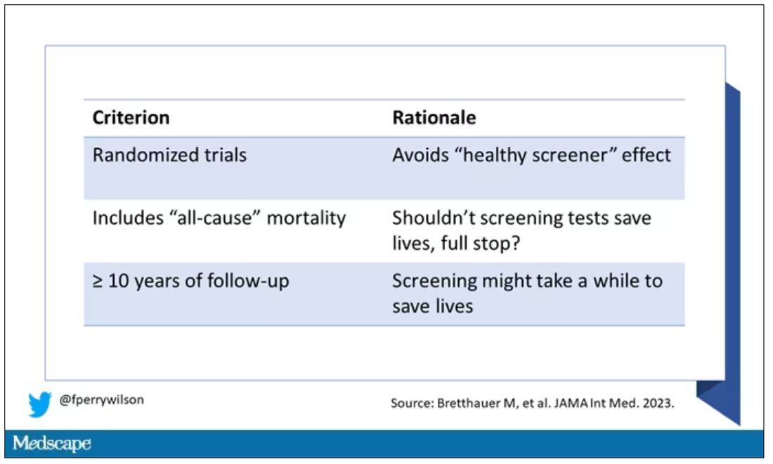
They didn’t stop at just randomized trials, though. They wanted trials that reported on all-cause, not cancer-specific, mortality. We’ll dig into the distinction in a sec. Finally, they wanted trials with at least 10 years of follow-up time.
These are pretty strict criteria – and after applying that filter, we are left with a grand total of 18 studies to analyze. Most were in the colon cancer space; only two studies met criteria for mammography screening.
Right off the bat, this raises concerns to me. In the universe of high-quality studies of cancer screening modalities, this is just the tip of the iceberg. And the results of meta-analyses are always dependent on the included studies – definitionally.
The results as presented are compelling.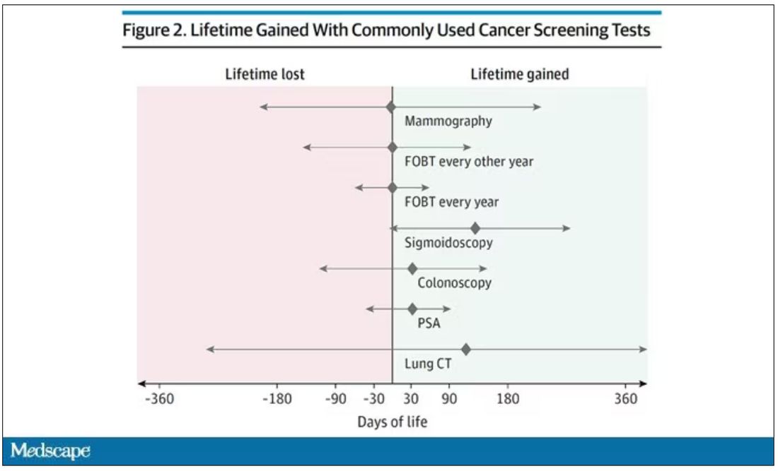
(Side note: Averages are tricky here. It’s not like everyone who gets screened gets 110 extra days. Most people get nothing, and some people – those whose colon cancer was detected early – get a bunch of extra days.)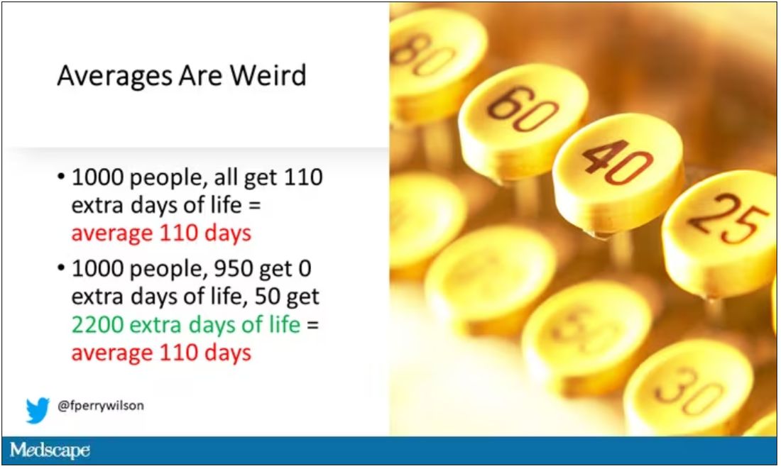
And a thing about meta-analysis: Meeting the criteria to be included in a meta-analysis does not necessarily mean the study was a good one. For example, one of the two mammography screening studies included is this one, from Miller and colleagues.
On the surface, it looks good – a large randomized trial of mammography screening in Canada, with long-term follow-up including all-cause mortality. Showing, by the way, no effect of screening on either breast cancer–specific or all-cause mortality.
But that study came under a lot of criticism owing to allegations that randomization was broken and women with palpable breast masses were preferentially put into the mammography group, making those outcomes worse.
The authors of the current meta-analysis don’t mention this. Indeed, they state that they don’t perform any assessments of the quality of the included studies.
But I don’t want to criticize all the included studies. Let’s think bigger picture.
Randomized trials of screening for cancers like colon, breast, and lung cancer in smokers have generally shown that those randomized to screening had lower target-cancer–specific mortality. Across all the randomized mammography studies, for example, women randomized to mammography were about 20% less likely to die of breast cancer than were those who were randomized to not be screened – particularly among those above age 50.
But it’s true that all-cause mortality, on the whole, has not differed statistically between those randomized to mammography vs. no mammography. What’s the deal?
Well, the authors of the meta-analysis engage in some zero-sum thinking here. They say that if it is true that screening tests reduce cancer-specific deaths, but all-cause mortality is not different, screening tests must increase mortality due to other causes. How? They cite colonic perforation during colonoscopy as an example of a harm that could lead to earlier death, which makes some sense. For mammogram and other less invasive screening modalities, they suggest that the stress and anxiety associated with screening might increase the risk for death – this is a bit harder for me to defend.
The thing is, statistics really isn’t a zero-sum game. It’s a question of signal vs. noise. Take breast cancer, for example. Without screening, about 3.2% of women in this country would die of breast cancer. With screening, 2.8% would die (that’s a 20% reduction on the relative scale). The truth is, most women don’t die of breast cancer. Most people don’t die of colon cancer. Even most smokers don’t die of lung cancer. Most people die of heart disease. And then cancer – but there are a lot of cancers out there, and only a handful have decent screening tests.
In other words, the screening tests are unlikely to help most people because most people will not die of the particular type of cancer being screened for. But it will help some small number of those people being screened a lot, potentially saving their lives. If we knew who those people were in advance, it would be great, but then I suppose we wouldn’t need the screening test in the first place.
It’s not fair, then, to say that mammography increases non–breast cancer causes of death. In reality, it’s just that the impact of mammography on all-cause mortality is washed out by the random noise inherent to studying a sample of individuals rather than the entire population.
I’m reminded of that old story about the girl on the beach after a storm, throwing beached starfish back into the water. Someone comes by and says, “Why are you doing that? There are millions of starfish here – it doesn’t matter if you throw a few back.” And she says, “It matters for this one.”
There are other issues with aggregating data like these and concluding that there is no effect on all-cause mortality. For one, it assumes the people randomized to no screening never got screening. Most of these studies lasted 5-10 years, some with longer follow-up, but many people in the no-screening arm may have been screened as recommendations have changed. That would tend to bias the results against screening because the so-called control group, well, isn’t.
It also fails to acknowledge the reality that screening for disease can be thought of as a package deal. Instead of asking whether screening for breast cancer, and colon cancer, and lung cancer individually saves lives, the real relevant question is whether a policy of screening for cancer in general saves lives. And that hasn’t been studied very broadly, except in one trial looking at screening for four cancers. That study is in this meta-analysis and, interestingly, seems to suggest that the policy does extend life – by 123 days. Again, be careful how you think about that average.
I don’t want to be an absolutist here. Whether these screening tests are a good idea or not is actually a moving target. As treatment for cancer gets better, detecting cancer early may not be as important. As new screening modalities emerge, older ones may not be preferable any longer. Better testing, genetic or otherwise, might allow us to tailor screening more narrowly than the population-based approach we have now.
But I worry that a meta-analysis like this, which concludes that screening doesn’t help on the basis of a handful of studies – without acknowledgment of the signal-to-noise problem, without accounting for screening in the control group, without acknowledging that screening should be thought of as a package – will lead some people to make the decision to forgo screening. for, say, 49 out of 50 of them, that may be fine. But for 1 out of 50 or so, well, it matters for that one.
F. Perry Wilson, MD, MSCE, is an associate professor of medicine and director of Yale’s Clinical and Translational Research Accelerator. His science communication work can be found in the Huffington Post, on NPR, and on Medscape. He tweets @fperrywilson and his new book, How Medicine Works and When It Doesn’t, is available now. He has disclosed no relevant financial relationships.
A version of this article first appeared on Medscape.com.
This transcript from Impact Factor has been edited for clarity.
If you are my age or older, and like me, you are something of a rule follower, then you’re getting screened for various cancers.
Colonoscopies, mammograms, cervical cancer screening, chest CTs for people with a significant smoking history. The tests are done and usually, but not always, they are negative. And if positive, usually, but not always, follow-up tests are negative, and if they aren’t and a new cancer is diagnosed you tell yourself, Well, at least we caught it early. Isn’t it good that I’m a rule follower? My life was just saved.
But it turns out, proving that cancer screening actually saves lives is quite difficult. Is it possible that all this screening is for nothing?
The benefits, risks, or perhaps futility of cancer screening is in the news this week because of this article, appearing in JAMA Internal Medicine.
It’s a meta-analysis of very specific randomized trials of cancer screening modalities and concludes that, with the exception of sigmoidoscopy for colon cancer screening, none of them meaningfully change life expectancy.
Now – a bit of inside baseball here – I almost never choose to discuss meta-analyses on Impact Factor. It’s hard enough to dig deep into the methodology of a single study, but with a meta-analysis, you’re sort of obligated to review all the included studies, and, what’s worse, the studies that were not included but might bear on the central question.
In this case, though, the topic is important enough to think about a bit more, and the conclusions have large enough implications for public health that we should question them a bit.
First, let’s run down the study as presented.
The authors searched for randomized trials of cancer screening modalities. This is important, and I think appropriate. They wanted studies that took some people and assigned them to screening, and some people to no screening – avoiding the confounding that would come from observational data (rule followers like me tend to live longer owing to a variety of healthful behaviors, not just cancer screening).
They didn’t stop at just randomized trials, though. They wanted trials that reported on all-cause, not cancer-specific, mortality. We’ll dig into the distinction in a sec. Finally, they wanted trials with at least 10 years of follow-up time.
These are pretty strict criteria – and after applying that filter, we are left with a grand total of 18 studies to analyze. Most were in the colon cancer space; only two studies met criteria for mammography screening.
Right off the bat, this raises concerns to me. In the universe of high-quality studies of cancer screening modalities, this is just the tip of the iceberg. And the results of meta-analyses are always dependent on the included studies – definitionally.
The results as presented are compelling.
(Side note: Averages are tricky here. It’s not like everyone who gets screened gets 110 extra days. Most people get nothing, and some people – those whose colon cancer was detected early – get a bunch of extra days.)
And a thing about meta-analysis: Meeting the criteria to be included in a meta-analysis does not necessarily mean the study was a good one. For example, one of the two mammography screening studies included is this one, from Miller and colleagues.
On the surface, it looks good – a large randomized trial of mammography screening in Canada, with long-term follow-up including all-cause mortality. Showing, by the way, no effect of screening on either breast cancer–specific or all-cause mortality.
But that study came under a lot of criticism owing to allegations that randomization was broken and women with palpable breast masses were preferentially put into the mammography group, making those outcomes worse.
The authors of the current meta-analysis don’t mention this. Indeed, they state that they don’t perform any assessments of the quality of the included studies.
But I don’t want to criticize all the included studies. Let’s think bigger picture.
Randomized trials of screening for cancers like colon, breast, and lung cancer in smokers have generally shown that those randomized to screening had lower target-cancer–specific mortality. Across all the randomized mammography studies, for example, women randomized to mammography were about 20% less likely to die of breast cancer than were those who were randomized to not be screened – particularly among those above age 50.
But it’s true that all-cause mortality, on the whole, has not differed statistically between those randomized to mammography vs. no mammography. What’s the deal?
Well, the authors of the meta-analysis engage in some zero-sum thinking here. They say that if it is true that screening tests reduce cancer-specific deaths, but all-cause mortality is not different, screening tests must increase mortality due to other causes. How? They cite colonic perforation during colonoscopy as an example of a harm that could lead to earlier death, which makes some sense. For mammogram and other less invasive screening modalities, they suggest that the stress and anxiety associated with screening might increase the risk for death – this is a bit harder for me to defend.
The thing is, statistics really isn’t a zero-sum game. It’s a question of signal vs. noise. Take breast cancer, for example. Without screening, about 3.2% of women in this country would die of breast cancer. With screening, 2.8% would die (that’s a 20% reduction on the relative scale). The truth is, most women don’t die of breast cancer. Most people don’t die of colon cancer. Even most smokers don’t die of lung cancer. Most people die of heart disease. And then cancer – but there are a lot of cancers out there, and only a handful have decent screening tests.
In other words, the screening tests are unlikely to help most people because most people will not die of the particular type of cancer being screened for. But it will help some small number of those people being screened a lot, potentially saving their lives. If we knew who those people were in advance, it would be great, but then I suppose we wouldn’t need the screening test in the first place.
It’s not fair, then, to say that mammography increases non–breast cancer causes of death. In reality, it’s just that the impact of mammography on all-cause mortality is washed out by the random noise inherent to studying a sample of individuals rather than the entire population.
I’m reminded of that old story about the girl on the beach after a storm, throwing beached starfish back into the water. Someone comes by and says, “Why are you doing that? There are millions of starfish here – it doesn’t matter if you throw a few back.” And she says, “It matters for this one.”
There are other issues with aggregating data like these and concluding that there is no effect on all-cause mortality. For one, it assumes the people randomized to no screening never got screening. Most of these studies lasted 5-10 years, some with longer follow-up, but many people in the no-screening arm may have been screened as recommendations have changed. That would tend to bias the results against screening because the so-called control group, well, isn’t.
It also fails to acknowledge the reality that screening for disease can be thought of as a package deal. Instead of asking whether screening for breast cancer, and colon cancer, and lung cancer individually saves lives, the real relevant question is whether a policy of screening for cancer in general saves lives. And that hasn’t been studied very broadly, except in one trial looking at screening for four cancers. That study is in this meta-analysis and, interestingly, seems to suggest that the policy does extend life – by 123 days. Again, be careful how you think about that average.
I don’t want to be an absolutist here. Whether these screening tests are a good idea or not is actually a moving target. As treatment for cancer gets better, detecting cancer early may not be as important. As new screening modalities emerge, older ones may not be preferable any longer. Better testing, genetic or otherwise, might allow us to tailor screening more narrowly than the population-based approach we have now.
But I worry that a meta-analysis like this, which concludes that screening doesn’t help on the basis of a handful of studies – without acknowledgment of the signal-to-noise problem, without accounting for screening in the control group, without acknowledging that screening should be thought of as a package – will lead some people to make the decision to forgo screening. for, say, 49 out of 50 of them, that may be fine. But for 1 out of 50 or so, well, it matters for that one.
F. Perry Wilson, MD, MSCE, is an associate professor of medicine and director of Yale’s Clinical and Translational Research Accelerator. His science communication work can be found in the Huffington Post, on NPR, and on Medscape. He tweets @fperrywilson and his new book, How Medicine Works and When It Doesn’t, is available now. He has disclosed no relevant financial relationships.
A version of this article first appeared on Medscape.com.
This transcript from Impact Factor has been edited for clarity.
If you are my age or older, and like me, you are something of a rule follower, then you’re getting screened for various cancers.
Colonoscopies, mammograms, cervical cancer screening, chest CTs for people with a significant smoking history. The tests are done and usually, but not always, they are negative. And if positive, usually, but not always, follow-up tests are negative, and if they aren’t and a new cancer is diagnosed you tell yourself, Well, at least we caught it early. Isn’t it good that I’m a rule follower? My life was just saved.
But it turns out, proving that cancer screening actually saves lives is quite difficult. Is it possible that all this screening is for nothing?
The benefits, risks, or perhaps futility of cancer screening is in the news this week because of this article, appearing in JAMA Internal Medicine.
It’s a meta-analysis of very specific randomized trials of cancer screening modalities and concludes that, with the exception of sigmoidoscopy for colon cancer screening, none of them meaningfully change life expectancy.
Now – a bit of inside baseball here – I almost never choose to discuss meta-analyses on Impact Factor. It’s hard enough to dig deep into the methodology of a single study, but with a meta-analysis, you’re sort of obligated to review all the included studies, and, what’s worse, the studies that were not included but might bear on the central question.
In this case, though, the topic is important enough to think about a bit more, and the conclusions have large enough implications for public health that we should question them a bit.
First, let’s run down the study as presented.
The authors searched for randomized trials of cancer screening modalities. This is important, and I think appropriate. They wanted studies that took some people and assigned them to screening, and some people to no screening – avoiding the confounding that would come from observational data (rule followers like me tend to live longer owing to a variety of healthful behaviors, not just cancer screening).
They didn’t stop at just randomized trials, though. They wanted trials that reported on all-cause, not cancer-specific, mortality. We’ll dig into the distinction in a sec. Finally, they wanted trials with at least 10 years of follow-up time.
These are pretty strict criteria – and after applying that filter, we are left with a grand total of 18 studies to analyze. Most were in the colon cancer space; only two studies met criteria for mammography screening.
Right off the bat, this raises concerns to me. In the universe of high-quality studies of cancer screening modalities, this is just the tip of the iceberg. And the results of meta-analyses are always dependent on the included studies – definitionally.
The results as presented are compelling.
(Side note: Averages are tricky here. It’s not like everyone who gets screened gets 110 extra days. Most people get nothing, and some people – those whose colon cancer was detected early – get a bunch of extra days.)
And a thing about meta-analysis: Meeting the criteria to be included in a meta-analysis does not necessarily mean the study was a good one. For example, one of the two mammography screening studies included is this one, from Miller and colleagues.
On the surface, it looks good – a large randomized trial of mammography screening in Canada, with long-term follow-up including all-cause mortality. Showing, by the way, no effect of screening on either breast cancer–specific or all-cause mortality.
But that study came under a lot of criticism owing to allegations that randomization was broken and women with palpable breast masses were preferentially put into the mammography group, making those outcomes worse.
The authors of the current meta-analysis don’t mention this. Indeed, they state that they don’t perform any assessments of the quality of the included studies.
But I don’t want to criticize all the included studies. Let’s think bigger picture.
Randomized trials of screening for cancers like colon, breast, and lung cancer in smokers have generally shown that those randomized to screening had lower target-cancer–specific mortality. Across all the randomized mammography studies, for example, women randomized to mammography were about 20% less likely to die of breast cancer than were those who were randomized to not be screened – particularly among those above age 50.
But it’s true that all-cause mortality, on the whole, has not differed statistically between those randomized to mammography vs. no mammography. What’s the deal?
Well, the authors of the meta-analysis engage in some zero-sum thinking here. They say that if it is true that screening tests reduce cancer-specific deaths, but all-cause mortality is not different, screening tests must increase mortality due to other causes. How? They cite colonic perforation during colonoscopy as an example of a harm that could lead to earlier death, which makes some sense. For mammogram and other less invasive screening modalities, they suggest that the stress and anxiety associated with screening might increase the risk for death – this is a bit harder for me to defend.
The thing is, statistics really isn’t a zero-sum game. It’s a question of signal vs. noise. Take breast cancer, for example. Without screening, about 3.2% of women in this country would die of breast cancer. With screening, 2.8% would die (that’s a 20% reduction on the relative scale). The truth is, most women don’t die of breast cancer. Most people don’t die of colon cancer. Even most smokers don’t die of lung cancer. Most people die of heart disease. And then cancer – but there are a lot of cancers out there, and only a handful have decent screening tests.
In other words, the screening tests are unlikely to help most people because most people will not die of the particular type of cancer being screened for. But it will help some small number of those people being screened a lot, potentially saving their lives. If we knew who those people were in advance, it would be great, but then I suppose we wouldn’t need the screening test in the first place.
It’s not fair, then, to say that mammography increases non–breast cancer causes of death. In reality, it’s just that the impact of mammography on all-cause mortality is washed out by the random noise inherent to studying a sample of individuals rather than the entire population.
I’m reminded of that old story about the girl on the beach after a storm, throwing beached starfish back into the water. Someone comes by and says, “Why are you doing that? There are millions of starfish here – it doesn’t matter if you throw a few back.” And she says, “It matters for this one.”
There are other issues with aggregating data like these and concluding that there is no effect on all-cause mortality. For one, it assumes the people randomized to no screening never got screening. Most of these studies lasted 5-10 years, some with longer follow-up, but many people in the no-screening arm may have been screened as recommendations have changed. That would tend to bias the results against screening because the so-called control group, well, isn’t.
It also fails to acknowledge the reality that screening for disease can be thought of as a package deal. Instead of asking whether screening for breast cancer, and colon cancer, and lung cancer individually saves lives, the real relevant question is whether a policy of screening for cancer in general saves lives. And that hasn’t been studied very broadly, except in one trial looking at screening for four cancers. That study is in this meta-analysis and, interestingly, seems to suggest that the policy does extend life – by 123 days. Again, be careful how you think about that average.
I don’t want to be an absolutist here. Whether these screening tests are a good idea or not is actually a moving target. As treatment for cancer gets better, detecting cancer early may not be as important. As new screening modalities emerge, older ones may not be preferable any longer. Better testing, genetic or otherwise, might allow us to tailor screening more narrowly than the population-based approach we have now.
But I worry that a meta-analysis like this, which concludes that screening doesn’t help on the basis of a handful of studies – without acknowledgment of the signal-to-noise problem, without accounting for screening in the control group, without acknowledging that screening should be thought of as a package – will lead some people to make the decision to forgo screening. for, say, 49 out of 50 of them, that may be fine. But for 1 out of 50 or so, well, it matters for that one.
F. Perry Wilson, MD, MSCE, is an associate professor of medicine and director of Yale’s Clinical and Translational Research Accelerator. His science communication work can be found in the Huffington Post, on NPR, and on Medscape. He tweets @fperrywilson and his new book, How Medicine Works and When It Doesn’t, is available now. He has disclosed no relevant financial relationships.
A version of this article first appeared on Medscape.com.
On the best way to exercise
This transcript has been edited for clarity.
I’m going to talk about something important to a lot of us, based on a new study that has just come out that promises to tell us the right way to exercise. This is a major issue as we think about the best ways to stay healthy.
There are basically two main types of exercise that exercise physiologists think about. There are aerobic exercises: the cardiovascular things like running on a treadmill or outside. Then there are muscle-strengthening exercises: lifting weights, calisthenics, and so on. And of course, plenty of exercises do both at the same time.
It seems that the era of aerobic exercise as the main way to improve health was the 1980s and early 1990s. Then we started to increasingly recognize that muscle-strengthening exercise was really important too. We’ve got a ton of data on the benefits of cardiovascular and aerobic exercise (a reduced risk for cardiovascular disease, cancer, and all-cause mortality, and even improved cognitive function) across a variety of study designs, including cohort studies, but also some randomized controlled trials where people were randomized to aerobic activity.
We’re starting to get more data on the benefits of muscle-strengthening exercises, although it hasn’t been in the zeitgeist as much. Obviously, this increases strength and may reduce visceral fat, increase anaerobic capacity and muscle mass, and therefore [increase the] basal metabolic rate. What is really interesting about muscle strengthening is that muscle just takes up more energy at rest, so building bigger muscles increases your basal energy expenditure and increases insulin sensitivity because muscle is a good insulin sensitizer.
So, do you do both? Do you do one? Do you do the other? What’s the right answer here?
it depends on who you ask. The Center for Disease Control and Prevention’s recommendation, which changes from time to time, is that you should do at least 150 minutes a week of moderate-intensity aerobic activity. Anything that gets your heart beating faster counts here. So that’s 30 minutes, 5 days a week. They also say you can do 75 minutes a week of vigorous-intensity aerobic activity – something that really gets your heart rate up and you are breaking a sweat. Now they also recommend at least 2 days a week of a muscle-strengthening activity that makes your muscles work harder than usual, whether that’s push-ups or lifting weights or something like that.
The World Health Organization is similar. They don’t target 150 minutes a week. They actually say at least 150 and up to 300 minutes of moderate-intensity physical activity or 75-150 minutes of vigorous intensity aerobic physical activity. They are setting the floor, whereas the CDC sets its target and then they go a bit higher. They also recommend 2 days of muscle strengthening per week for optimal health.
But what do the data show? Why am I talking about this? It’s because of this new study in JAMA Internal Medicine by Ruben Lopez Bueno and colleagues. I’m going to focus on all-cause mortality for brevity, but the results are broadly similar.
The data source is the U.S. National Health Interview Survey. A total of 500,705 people took part in the survey and answered a slew of questions (including self-reports on their exercise amounts), with a median follow-up of about 10 years looking for things like cardiovascular deaths, cancer deaths, and so on.
The survey classified people into different exercise categories – how much time they spent doing moderate physical activity (MPA), vigorous physical activity (VPA), or muscle-strengthening activity (MSA).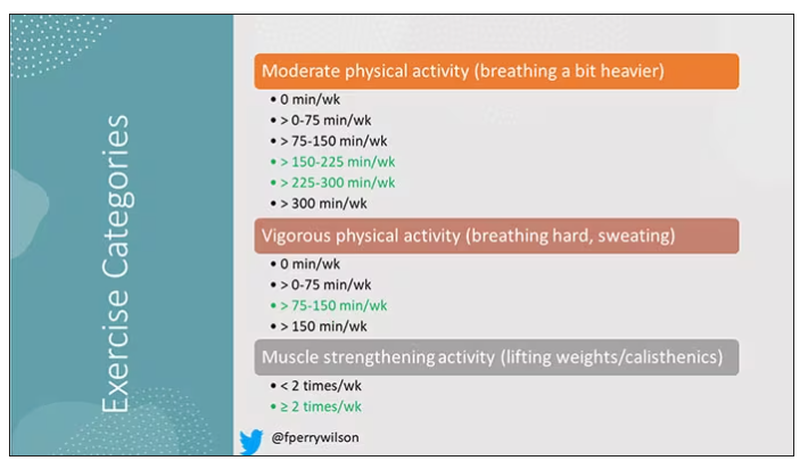
There are six categories based on duration of MPA (the WHO targets are highlighted in green), four categories based on length of time of VPA, and two categories of MSA (≥ or < two times per week). This gives a total of 48 possible combinations of exercise you could do in a typical week.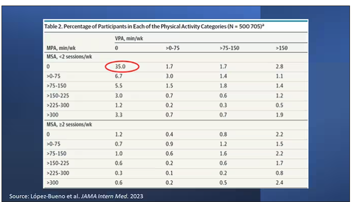
Here are the percentages of people who fell into each of these 48 potential categories. The largest is the 35% of people who fell into the “nothing” category (no MPA, no VPA, and less than two sessions per week of MSA). These “nothing” people are going to be a reference category moving forward.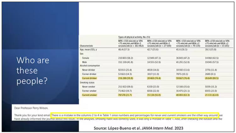
So who are these people? On the far left are the 361,000 people (the vast majority) who don’t hit that 150 minutes a week of MPA or 75 minutes a week of VPA, and they don’t do 2 days a week of MSA. The other three categories are increasing amounts of exercise. Younger people seem to be doing more exercise at the higher ends, and men are more likely to be doing exercise at the higher end. There are also some interesting findings from the alcohol drinking survey. The people who do more exercise are more likely to be current drinkers. This is interesting. I confirmed these data with the investigator. This might suggest one of the reasons why some studies have shown that drinkers have better outcomes in terms of either cardiovascular or cognitive outcomes over time. There’s a lot of conflicting data there, but in part, it might be that healthier people might drink more alcohol. It could be a socioeconomic phenomenon as well.
Now, what blew my mind were these smoker numbers, but don’t get too excited about it. What it looks like from the table in JAMA Internal Medicine is that 20% of the people who don’t do much exercise smoke, and then something like 60% of the people who do more exercise smoke. That can’t be right. So I checked with the lead study author. There is a mistake in these columns for smoking. They were supposed to flip the “never smoker” and “current smoker” numbers. You can actually see that just 15.2% of those who exercise a lot are current smokers, not 63.8%. This has been fixed online, but just in case you saw this and you were as confused as I was that these incredibly healthy smokers are out there exercising all the time, it was just a typo.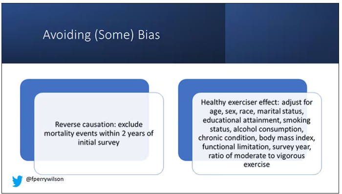
There is bias here. One of the big ones is called reverse causation bias. This is what might happen if, let’s say you’re already sick, you have cancer, you have some serious cardiovascular disease, or heart failure. You can’t exercise that much. You physically can’t do it. And then if you die, we wouldn’t find that exercise is beneficial. We would see that sicker people aren’t as able to exercise. The investigators got around this a bit by excluding mortality events within 2 years of the initial survey. Anyone who died within 2 years after saying how often they exercised was not included in this analysis.
This is known as the healthy exerciser or healthy user effect. Sometimes this means that people who exercise a lot probably do other healthy things; they might eat better or get out in the sun more. Researchers try to get around this through multivariable adjustment. They adjust for age, sex, race, marital status, etc. No adjustment is perfect. There’s always residual confounding. But this is probably the best you can do with the dataset like the one they had access to.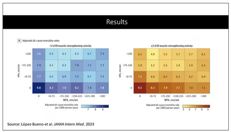
Let’s go to the results, which are nicely heat-mapped in the paper. They’re divided into people who have less or more than 2 days of MSA. Our reference groups that we want to pay attention to are the people who don’t do anything. The highest mortality of 9.8 individuals per 1,000 person-years is seen in the group that reported no moderate physical activity, no VPA, and less than 2 days a week of MSA.
As you move up and to the right (more VPA and MPA), you see lower numbers. The lowest number was 4.9 among people who reported more than 150 minutes per week of VPA and 2 days of MSA.
Looking at these data, the benefit, or the bang for your buck is higher for VPA than for MPA. Getting 2 days of MSA does have a tendency to reduce overall mortality. This is not necessarily causal, but it is rather potent and consistent across all the different groups.
So, what are we supposed to do here? I think the most clear finding from the study is that anything is better than nothing. This study suggests that if you are going to get activity, push on the vigorous activity if you’re physically able to do it. And of course, layering in the MSA as well seems to be associated with benefit.
Like everything in life, there’s no one simple solution. It’s a mix. But telling ourselves and our patients to get out there if you can and break a sweat as often as you can during the week, and take a couple of days to get those muscles a little bigger, may increase insulin sensitivity and basal metabolic rate – is it guaranteed to extend life? No. This is an observational study. We can’t say; we don’t have causal data here, but it’s unlikely to cause much harm. I’m particularly happy that people are doing a much better job now of really dissecting out the kinds of physical activity that are beneficial. It turns out that all of it is, and probably a mixture is best.
Dr. Wilson is associate professor, department of medicine, and interim director, program of applied translational research, Yale University, New Haven, Conn. He disclosed no relevant financial relationships.
A version of this article appeared on Medscape.com.
This transcript has been edited for clarity.
I’m going to talk about something important to a lot of us, based on a new study that has just come out that promises to tell us the right way to exercise. This is a major issue as we think about the best ways to stay healthy.
There are basically two main types of exercise that exercise physiologists think about. There are aerobic exercises: the cardiovascular things like running on a treadmill or outside. Then there are muscle-strengthening exercises: lifting weights, calisthenics, and so on. And of course, plenty of exercises do both at the same time.
It seems that the era of aerobic exercise as the main way to improve health was the 1980s and early 1990s. Then we started to increasingly recognize that muscle-strengthening exercise was really important too. We’ve got a ton of data on the benefits of cardiovascular and aerobic exercise (a reduced risk for cardiovascular disease, cancer, and all-cause mortality, and even improved cognitive function) across a variety of study designs, including cohort studies, but also some randomized controlled trials where people were randomized to aerobic activity.
We’re starting to get more data on the benefits of muscle-strengthening exercises, although it hasn’t been in the zeitgeist as much. Obviously, this increases strength and may reduce visceral fat, increase anaerobic capacity and muscle mass, and therefore [increase the] basal metabolic rate. What is really interesting about muscle strengthening is that muscle just takes up more energy at rest, so building bigger muscles increases your basal energy expenditure and increases insulin sensitivity because muscle is a good insulin sensitizer.
So, do you do both? Do you do one? Do you do the other? What’s the right answer here?
it depends on who you ask. The Center for Disease Control and Prevention’s recommendation, which changes from time to time, is that you should do at least 150 minutes a week of moderate-intensity aerobic activity. Anything that gets your heart beating faster counts here. So that’s 30 minutes, 5 days a week. They also say you can do 75 minutes a week of vigorous-intensity aerobic activity – something that really gets your heart rate up and you are breaking a sweat. Now they also recommend at least 2 days a week of a muscle-strengthening activity that makes your muscles work harder than usual, whether that’s push-ups or lifting weights or something like that.
The World Health Organization is similar. They don’t target 150 minutes a week. They actually say at least 150 and up to 300 minutes of moderate-intensity physical activity or 75-150 minutes of vigorous intensity aerobic physical activity. They are setting the floor, whereas the CDC sets its target and then they go a bit higher. They also recommend 2 days of muscle strengthening per week for optimal health.
But what do the data show? Why am I talking about this? It’s because of this new study in JAMA Internal Medicine by Ruben Lopez Bueno and colleagues. I’m going to focus on all-cause mortality for brevity, but the results are broadly similar.
The data source is the U.S. National Health Interview Survey. A total of 500,705 people took part in the survey and answered a slew of questions (including self-reports on their exercise amounts), with a median follow-up of about 10 years looking for things like cardiovascular deaths, cancer deaths, and so on.
The survey classified people into different exercise categories – how much time they spent doing moderate physical activity (MPA), vigorous physical activity (VPA), or muscle-strengthening activity (MSA).
There are six categories based on duration of MPA (the WHO targets are highlighted in green), four categories based on length of time of VPA, and two categories of MSA (≥ or < two times per week). This gives a total of 48 possible combinations of exercise you could do in a typical week.
Here are the percentages of people who fell into each of these 48 potential categories. The largest is the 35% of people who fell into the “nothing” category (no MPA, no VPA, and less than two sessions per week of MSA). These “nothing” people are going to be a reference category moving forward.
So who are these people? On the far left are the 361,000 people (the vast majority) who don’t hit that 150 minutes a week of MPA or 75 minutes a week of VPA, and they don’t do 2 days a week of MSA. The other three categories are increasing amounts of exercise. Younger people seem to be doing more exercise at the higher ends, and men are more likely to be doing exercise at the higher end. There are also some interesting findings from the alcohol drinking survey. The people who do more exercise are more likely to be current drinkers. This is interesting. I confirmed these data with the investigator. This might suggest one of the reasons why some studies have shown that drinkers have better outcomes in terms of either cardiovascular or cognitive outcomes over time. There’s a lot of conflicting data there, but in part, it might be that healthier people might drink more alcohol. It could be a socioeconomic phenomenon as well.
Now, what blew my mind were these smoker numbers, but don’t get too excited about it. What it looks like from the table in JAMA Internal Medicine is that 20% of the people who don’t do much exercise smoke, and then something like 60% of the people who do more exercise smoke. That can’t be right. So I checked with the lead study author. There is a mistake in these columns for smoking. They were supposed to flip the “never smoker” and “current smoker” numbers. You can actually see that just 15.2% of those who exercise a lot are current smokers, not 63.8%. This has been fixed online, but just in case you saw this and you were as confused as I was that these incredibly healthy smokers are out there exercising all the time, it was just a typo.
There is bias here. One of the big ones is called reverse causation bias. This is what might happen if, let’s say you’re already sick, you have cancer, you have some serious cardiovascular disease, or heart failure. You can’t exercise that much. You physically can’t do it. And then if you die, we wouldn’t find that exercise is beneficial. We would see that sicker people aren’t as able to exercise. The investigators got around this a bit by excluding mortality events within 2 years of the initial survey. Anyone who died within 2 years after saying how often they exercised was not included in this analysis.
This is known as the healthy exerciser or healthy user effect. Sometimes this means that people who exercise a lot probably do other healthy things; they might eat better or get out in the sun more. Researchers try to get around this through multivariable adjustment. They adjust for age, sex, race, marital status, etc. No adjustment is perfect. There’s always residual confounding. But this is probably the best you can do with the dataset like the one they had access to.
Let’s go to the results, which are nicely heat-mapped in the paper. They’re divided into people who have less or more than 2 days of MSA. Our reference groups that we want to pay attention to are the people who don’t do anything. The highest mortality of 9.8 individuals per 1,000 person-years is seen in the group that reported no moderate physical activity, no VPA, and less than 2 days a week of MSA.
As you move up and to the right (more VPA and MPA), you see lower numbers. The lowest number was 4.9 among people who reported more than 150 minutes per week of VPA and 2 days of MSA.
Looking at these data, the benefit, or the bang for your buck is higher for VPA than for MPA. Getting 2 days of MSA does have a tendency to reduce overall mortality. This is not necessarily causal, but it is rather potent and consistent across all the different groups.
So, what are we supposed to do here? I think the most clear finding from the study is that anything is better than nothing. This study suggests that if you are going to get activity, push on the vigorous activity if you’re physically able to do it. And of course, layering in the MSA as well seems to be associated with benefit.
Like everything in life, there’s no one simple solution. It’s a mix. But telling ourselves and our patients to get out there if you can and break a sweat as often as you can during the week, and take a couple of days to get those muscles a little bigger, may increase insulin sensitivity and basal metabolic rate – is it guaranteed to extend life? No. This is an observational study. We can’t say; we don’t have causal data here, but it’s unlikely to cause much harm. I’m particularly happy that people are doing a much better job now of really dissecting out the kinds of physical activity that are beneficial. It turns out that all of it is, and probably a mixture is best.
Dr. Wilson is associate professor, department of medicine, and interim director, program of applied translational research, Yale University, New Haven, Conn. He disclosed no relevant financial relationships.
A version of this article appeared on Medscape.com.
This transcript has been edited for clarity.
I’m going to talk about something important to a lot of us, based on a new study that has just come out that promises to tell us the right way to exercise. This is a major issue as we think about the best ways to stay healthy.
There are basically two main types of exercise that exercise physiologists think about. There are aerobic exercises: the cardiovascular things like running on a treadmill or outside. Then there are muscle-strengthening exercises: lifting weights, calisthenics, and so on. And of course, plenty of exercises do both at the same time.
It seems that the era of aerobic exercise as the main way to improve health was the 1980s and early 1990s. Then we started to increasingly recognize that muscle-strengthening exercise was really important too. We’ve got a ton of data on the benefits of cardiovascular and aerobic exercise (a reduced risk for cardiovascular disease, cancer, and all-cause mortality, and even improved cognitive function) across a variety of study designs, including cohort studies, but also some randomized controlled trials where people were randomized to aerobic activity.
We’re starting to get more data on the benefits of muscle-strengthening exercises, although it hasn’t been in the zeitgeist as much. Obviously, this increases strength and may reduce visceral fat, increase anaerobic capacity and muscle mass, and therefore [increase the] basal metabolic rate. What is really interesting about muscle strengthening is that muscle just takes up more energy at rest, so building bigger muscles increases your basal energy expenditure and increases insulin sensitivity because muscle is a good insulin sensitizer.
So, do you do both? Do you do one? Do you do the other? What’s the right answer here?
it depends on who you ask. The Center for Disease Control and Prevention’s recommendation, which changes from time to time, is that you should do at least 150 minutes a week of moderate-intensity aerobic activity. Anything that gets your heart beating faster counts here. So that’s 30 minutes, 5 days a week. They also say you can do 75 minutes a week of vigorous-intensity aerobic activity – something that really gets your heart rate up and you are breaking a sweat. Now they also recommend at least 2 days a week of a muscle-strengthening activity that makes your muscles work harder than usual, whether that’s push-ups or lifting weights or something like that.
The World Health Organization is similar. They don’t target 150 minutes a week. They actually say at least 150 and up to 300 minutes of moderate-intensity physical activity or 75-150 minutes of vigorous intensity aerobic physical activity. They are setting the floor, whereas the CDC sets its target and then they go a bit higher. They also recommend 2 days of muscle strengthening per week for optimal health.
But what do the data show? Why am I talking about this? It’s because of this new study in JAMA Internal Medicine by Ruben Lopez Bueno and colleagues. I’m going to focus on all-cause mortality for brevity, but the results are broadly similar.
The data source is the U.S. National Health Interview Survey. A total of 500,705 people took part in the survey and answered a slew of questions (including self-reports on their exercise amounts), with a median follow-up of about 10 years looking for things like cardiovascular deaths, cancer deaths, and so on.
The survey classified people into different exercise categories – how much time they spent doing moderate physical activity (MPA), vigorous physical activity (VPA), or muscle-strengthening activity (MSA).
There are six categories based on duration of MPA (the WHO targets are highlighted in green), four categories based on length of time of VPA, and two categories of MSA (≥ or < two times per week). This gives a total of 48 possible combinations of exercise you could do in a typical week.
Here are the percentages of people who fell into each of these 48 potential categories. The largest is the 35% of people who fell into the “nothing” category (no MPA, no VPA, and less than two sessions per week of MSA). These “nothing” people are going to be a reference category moving forward.
So who are these people? On the far left are the 361,000 people (the vast majority) who don’t hit that 150 minutes a week of MPA or 75 minutes a week of VPA, and they don’t do 2 days a week of MSA. The other three categories are increasing amounts of exercise. Younger people seem to be doing more exercise at the higher ends, and men are more likely to be doing exercise at the higher end. There are also some interesting findings from the alcohol drinking survey. The people who do more exercise are more likely to be current drinkers. This is interesting. I confirmed these data with the investigator. This might suggest one of the reasons why some studies have shown that drinkers have better outcomes in terms of either cardiovascular or cognitive outcomes over time. There’s a lot of conflicting data there, but in part, it might be that healthier people might drink more alcohol. It could be a socioeconomic phenomenon as well.
Now, what blew my mind were these smoker numbers, but don’t get too excited about it. What it looks like from the table in JAMA Internal Medicine is that 20% of the people who don’t do much exercise smoke, and then something like 60% of the people who do more exercise smoke. That can’t be right. So I checked with the lead study author. There is a mistake in these columns for smoking. They were supposed to flip the “never smoker” and “current smoker” numbers. You can actually see that just 15.2% of those who exercise a lot are current smokers, not 63.8%. This has been fixed online, but just in case you saw this and you were as confused as I was that these incredibly healthy smokers are out there exercising all the time, it was just a typo.
There is bias here. One of the big ones is called reverse causation bias. This is what might happen if, let’s say you’re already sick, you have cancer, you have some serious cardiovascular disease, or heart failure. You can’t exercise that much. You physically can’t do it. And then if you die, we wouldn’t find that exercise is beneficial. We would see that sicker people aren’t as able to exercise. The investigators got around this a bit by excluding mortality events within 2 years of the initial survey. Anyone who died within 2 years after saying how often they exercised was not included in this analysis.
This is known as the healthy exerciser or healthy user effect. Sometimes this means that people who exercise a lot probably do other healthy things; they might eat better or get out in the sun more. Researchers try to get around this through multivariable adjustment. They adjust for age, sex, race, marital status, etc. No adjustment is perfect. There’s always residual confounding. But this is probably the best you can do with the dataset like the one they had access to.
Let’s go to the results, which are nicely heat-mapped in the paper. They’re divided into people who have less or more than 2 days of MSA. Our reference groups that we want to pay attention to are the people who don’t do anything. The highest mortality of 9.8 individuals per 1,000 person-years is seen in the group that reported no moderate physical activity, no VPA, and less than 2 days a week of MSA.
As you move up and to the right (more VPA and MPA), you see lower numbers. The lowest number was 4.9 among people who reported more than 150 minutes per week of VPA and 2 days of MSA.
Looking at these data, the benefit, or the bang for your buck is higher for VPA than for MPA. Getting 2 days of MSA does have a tendency to reduce overall mortality. This is not necessarily causal, but it is rather potent and consistent across all the different groups.
So, what are we supposed to do here? I think the most clear finding from the study is that anything is better than nothing. This study suggests that if you are going to get activity, push on the vigorous activity if you’re physically able to do it. And of course, layering in the MSA as well seems to be associated with benefit.
Like everything in life, there’s no one simple solution. It’s a mix. But telling ourselves and our patients to get out there if you can and break a sweat as often as you can during the week, and take a couple of days to get those muscles a little bigger, may increase insulin sensitivity and basal metabolic rate – is it guaranteed to extend life? No. This is an observational study. We can’t say; we don’t have causal data here, but it’s unlikely to cause much harm. I’m particularly happy that people are doing a much better job now of really dissecting out the kinds of physical activity that are beneficial. It turns out that all of it is, and probably a mixture is best.
Dr. Wilson is associate professor, department of medicine, and interim director, program of applied translational research, Yale University, New Haven, Conn. He disclosed no relevant financial relationships.
A version of this article appeared on Medscape.com.
A new and completely different pain medicine
This transcript has been edited for clarity.
When you stub your toe or get a paper cut on your finger, you feel the pain in that part of your body. It feels like the pain is coming from that place. But, of course, that’s not really what is happening. Pain doesn’t really happen in your toe or your finger. It happens in your brain.
It’s a game of telephone, really. The afferent nerve fiber detects the noxious stimulus, passing that signal to the second-order neuron in the dorsal root ganglia of the spinal cord, which runs it up to the thalamus to be passed to the third-order neuron which brings it to the cortex for localization and conscious perception. It’s not even a very good game of telephone. It takes about 100 ms for a pain signal to get from the hand to the brain – longer from the feet, given the greater distance. You see your foot hit the corner of the coffee table and have just enough time to think: “Oh no!” before the pain hits.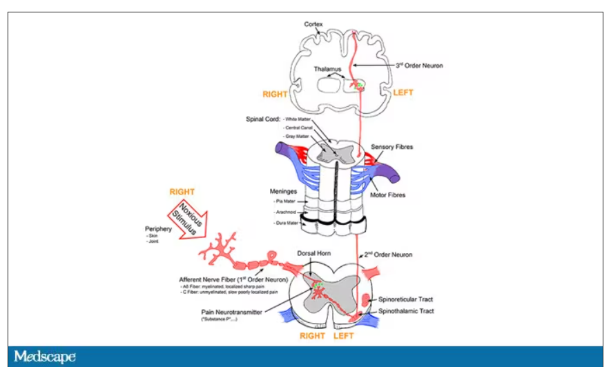
Given the Rube Goldberg nature of the process, it would seem like there are any number of places we could stop pain sensation. And sure, local anesthetics at the site of injury, or even spinal anesthetics, are powerful – if temporary and hard to administer – solutions to acute pain.
But in our everyday armamentarium, let’s be honest – we essentially have three options: opiates and opioids, which activate the mu-receptors in the brain to dull pain (and cause a host of other nasty side effects); NSAIDs, which block prostaglandin synthesis and thus limit the ability for pain-conducting neurons to get excited; and acetaminophen, which, despite being used for a century, is poorly understood.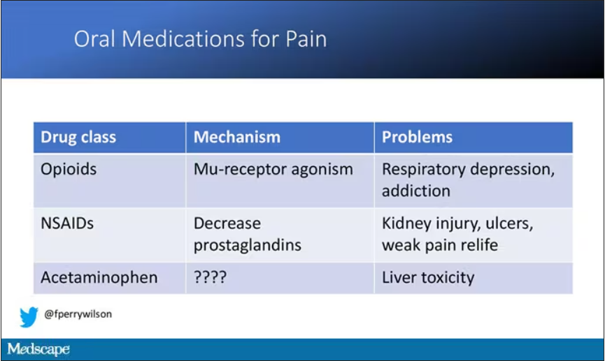
But
If you were to zoom in on the connection between that first afferent pain fiber and the secondary nerve in the spinal cord dorsal root ganglion, you would see a receptor called Nav1.8, a voltage-gated sodium channel.
This receptor is a key part of the apparatus that passes information from nerve 1 to nerve 2, but only for fibers that transmit pain signals. In fact, humans with mutations in this receptor that leave it always in the “open” state have a severe pain syndrome. Blocking the receptor, therefore, might reduce pain.
In preclinical work, researchers identified VX-548, which doesn’t have a brand name yet, as a potent blocker of that channel even in nanomolar concentrations. Importantly, the compound was highly selective for that particular channel – about 30,000 times more selective than it was for the other sodium channels in that family.
Of course, a highly selective and specific drug does not a blockbuster analgesic make. To determine how this drug would work on humans in pain, they turned to two populations: 303 individuals undergoing abdominoplasty and 274 undergoing bunionectomy, as reported in a new paper in the New England Journal of Medicine.
I know this seems a bit random, but abdominoplasty is quite painful and a good model for soft-tissue pain. Bunionectomy is also quite a painful procedure and a useful model of bone pain. After the surgeries, patients were randomized to several different doses of VX-548, hydrocodone plus acetaminophen, or placebo for 48 hours.
At 19 time points over that 48-hour period, participants were asked to rate their pain on a scale from 0 to 10. The primary outcome was the cumulative pain experienced over the 48 hours. So, higher pain would be worse here, but longer duration of pain would also be worse.
The story of the study is really told in this chart.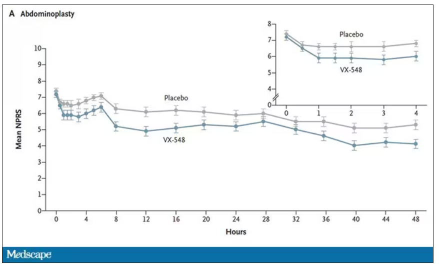
Yes, those assigned to the highest dose of VX-548 had a statistically significant lower cumulative amount of pain in the 48 hours after surgery. But the picture is really worth more than the stats here. You can see that the onset of pain relief was fairly quick, and that pain relief was sustained over time. You can also see that this is not a miracle drug. Pain scores were a bit better 48 hours out, but only by about a point and a half.
Placebo isn’t really the fair comparison here; few of us treat our postabdominoplasty patients with placebo, after all. The authors do not formally compare the effect of VX-548 with that of the opioid hydrocodone, for instance. But that doesn’t stop us.
This graph, which I put together from data in the paper, shows pain control across the four randomization categories, with higher numbers indicating more (cumulative) control. While all the active agents do a bit better than placebo, VX-548 at the higher dose appears to do the best. But I should note that 5 mg of hydrocodone may not be an adequate dose for most people.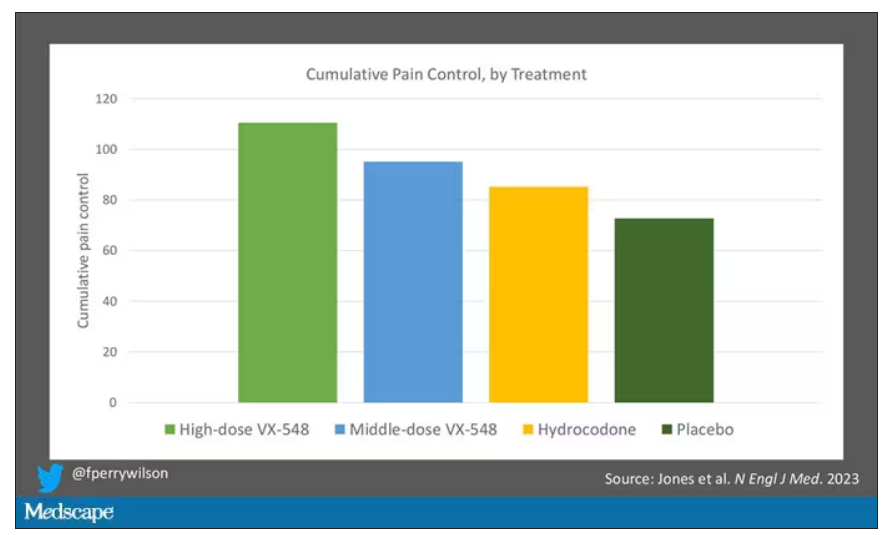
Yes, I would really have killed for an NSAID arm in this trial. Its absence, given that NSAIDs are a staple of postoperative care, is ... well, let’s just say, notable.
Although not a pain-destroying machine, VX-548 has some other things to recommend it. The receptor is really not found in the brain at all, which suggests that the drug should not carry much risk for dependency, though that has not been formally studied.
The side effects were generally mild – headache was the most common – and less prevalent than what you see even in the placebo arm.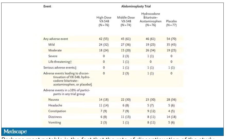
Perhaps most notable is the fact that the rate of discontinuation of the study drug was lowest in the VX-548 arm. Patients could stop taking the pill they were assigned for any reason, ranging from perceived lack of efficacy to side effects. A low discontinuation rate indicates to me a sort of “voting with your feet” that suggests this might be a well-tolerated and reasonably effective drug.
VX-548 isn’t on the market yet; phase 3 trials are ongoing. But whether it is this particular drug or another in this class, I’m happy to see researchers trying to find new ways to target that most primeval form of suffering: pain.
Dr. Wilson is an associate professor of medicine and public health and director of Yale’s Clinical and Translational Research Accelerator, New Haven, Conn. He disclosed no relevant financial relationships.
A version of this article appeared on Medscape.com.
This transcript has been edited for clarity.
When you stub your toe or get a paper cut on your finger, you feel the pain in that part of your body. It feels like the pain is coming from that place. But, of course, that’s not really what is happening. Pain doesn’t really happen in your toe or your finger. It happens in your brain.
It’s a game of telephone, really. The afferent nerve fiber detects the noxious stimulus, passing that signal to the second-order neuron in the dorsal root ganglia of the spinal cord, which runs it up to the thalamus to be passed to the third-order neuron which brings it to the cortex for localization and conscious perception. It’s not even a very good game of telephone. It takes about 100 ms for a pain signal to get from the hand to the brain – longer from the feet, given the greater distance. You see your foot hit the corner of the coffee table and have just enough time to think: “Oh no!” before the pain hits.
Given the Rube Goldberg nature of the process, it would seem like there are any number of places we could stop pain sensation. And sure, local anesthetics at the site of injury, or even spinal anesthetics, are powerful – if temporary and hard to administer – solutions to acute pain.
But in our everyday armamentarium, let’s be honest – we essentially have three options: opiates and opioids, which activate the mu-receptors in the brain to dull pain (and cause a host of other nasty side effects); NSAIDs, which block prostaglandin synthesis and thus limit the ability for pain-conducting neurons to get excited; and acetaminophen, which, despite being used for a century, is poorly understood.
But
If you were to zoom in on the connection between that first afferent pain fiber and the secondary nerve in the spinal cord dorsal root ganglion, you would see a receptor called Nav1.8, a voltage-gated sodium channel.
This receptor is a key part of the apparatus that passes information from nerve 1 to nerve 2, but only for fibers that transmit pain signals. In fact, humans with mutations in this receptor that leave it always in the “open” state have a severe pain syndrome. Blocking the receptor, therefore, might reduce pain.
In preclinical work, researchers identified VX-548, which doesn’t have a brand name yet, as a potent blocker of that channel even in nanomolar concentrations. Importantly, the compound was highly selective for that particular channel – about 30,000 times more selective than it was for the other sodium channels in that family.
Of course, a highly selective and specific drug does not a blockbuster analgesic make. To determine how this drug would work on humans in pain, they turned to two populations: 303 individuals undergoing abdominoplasty and 274 undergoing bunionectomy, as reported in a new paper in the New England Journal of Medicine.
I know this seems a bit random, but abdominoplasty is quite painful and a good model for soft-tissue pain. Bunionectomy is also quite a painful procedure and a useful model of bone pain. After the surgeries, patients were randomized to several different doses of VX-548, hydrocodone plus acetaminophen, or placebo for 48 hours.
At 19 time points over that 48-hour period, participants were asked to rate their pain on a scale from 0 to 10. The primary outcome was the cumulative pain experienced over the 48 hours. So, higher pain would be worse here, but longer duration of pain would also be worse.
The story of the study is really told in this chart.
Yes, those assigned to the highest dose of VX-548 had a statistically significant lower cumulative amount of pain in the 48 hours after surgery. But the picture is really worth more than the stats here. You can see that the onset of pain relief was fairly quick, and that pain relief was sustained over time. You can also see that this is not a miracle drug. Pain scores were a bit better 48 hours out, but only by about a point and a half.
Placebo isn’t really the fair comparison here; few of us treat our postabdominoplasty patients with placebo, after all. The authors do not formally compare the effect of VX-548 with that of the opioid hydrocodone, for instance. But that doesn’t stop us.
This graph, which I put together from data in the paper, shows pain control across the four randomization categories, with higher numbers indicating more (cumulative) control. While all the active agents do a bit better than placebo, VX-548 at the higher dose appears to do the best. But I should note that 5 mg of hydrocodone may not be an adequate dose for most people.
Yes, I would really have killed for an NSAID arm in this trial. Its absence, given that NSAIDs are a staple of postoperative care, is ... well, let’s just say, notable.
Although not a pain-destroying machine, VX-548 has some other things to recommend it. The receptor is really not found in the brain at all, which suggests that the drug should not carry much risk for dependency, though that has not been formally studied.
The side effects were generally mild – headache was the most common – and less prevalent than what you see even in the placebo arm.
Perhaps most notable is the fact that the rate of discontinuation of the study drug was lowest in the VX-548 arm. Patients could stop taking the pill they were assigned for any reason, ranging from perceived lack of efficacy to side effects. A low discontinuation rate indicates to me a sort of “voting with your feet” that suggests this might be a well-tolerated and reasonably effective drug.
VX-548 isn’t on the market yet; phase 3 trials are ongoing. But whether it is this particular drug or another in this class, I’m happy to see researchers trying to find new ways to target that most primeval form of suffering: pain.
Dr. Wilson is an associate professor of medicine and public health and director of Yale’s Clinical and Translational Research Accelerator, New Haven, Conn. He disclosed no relevant financial relationships.
A version of this article appeared on Medscape.com.
This transcript has been edited for clarity.
When you stub your toe or get a paper cut on your finger, you feel the pain in that part of your body. It feels like the pain is coming from that place. But, of course, that’s not really what is happening. Pain doesn’t really happen in your toe or your finger. It happens in your brain.
It’s a game of telephone, really. The afferent nerve fiber detects the noxious stimulus, passing that signal to the second-order neuron in the dorsal root ganglia of the spinal cord, which runs it up to the thalamus to be passed to the third-order neuron which brings it to the cortex for localization and conscious perception. It’s not even a very good game of telephone. It takes about 100 ms for a pain signal to get from the hand to the brain – longer from the feet, given the greater distance. You see your foot hit the corner of the coffee table and have just enough time to think: “Oh no!” before the pain hits.
Given the Rube Goldberg nature of the process, it would seem like there are any number of places we could stop pain sensation. And sure, local anesthetics at the site of injury, or even spinal anesthetics, are powerful – if temporary and hard to administer – solutions to acute pain.
But in our everyday armamentarium, let’s be honest – we essentially have three options: opiates and opioids, which activate the mu-receptors in the brain to dull pain (and cause a host of other nasty side effects); NSAIDs, which block prostaglandin synthesis and thus limit the ability for pain-conducting neurons to get excited; and acetaminophen, which, despite being used for a century, is poorly understood.
But
If you were to zoom in on the connection between that first afferent pain fiber and the secondary nerve in the spinal cord dorsal root ganglion, you would see a receptor called Nav1.8, a voltage-gated sodium channel.
This receptor is a key part of the apparatus that passes information from nerve 1 to nerve 2, but only for fibers that transmit pain signals. In fact, humans with mutations in this receptor that leave it always in the “open” state have a severe pain syndrome. Blocking the receptor, therefore, might reduce pain.
In preclinical work, researchers identified VX-548, which doesn’t have a brand name yet, as a potent blocker of that channel even in nanomolar concentrations. Importantly, the compound was highly selective for that particular channel – about 30,000 times more selective than it was for the other sodium channels in that family.
Of course, a highly selective and specific drug does not a blockbuster analgesic make. To determine how this drug would work on humans in pain, they turned to two populations: 303 individuals undergoing abdominoplasty and 274 undergoing bunionectomy, as reported in a new paper in the New England Journal of Medicine.
I know this seems a bit random, but abdominoplasty is quite painful and a good model for soft-tissue pain. Bunionectomy is also quite a painful procedure and a useful model of bone pain. After the surgeries, patients were randomized to several different doses of VX-548, hydrocodone plus acetaminophen, or placebo for 48 hours.
At 19 time points over that 48-hour period, participants were asked to rate their pain on a scale from 0 to 10. The primary outcome was the cumulative pain experienced over the 48 hours. So, higher pain would be worse here, but longer duration of pain would also be worse.
The story of the study is really told in this chart.
Yes, those assigned to the highest dose of VX-548 had a statistically significant lower cumulative amount of pain in the 48 hours after surgery. But the picture is really worth more than the stats here. You can see that the onset of pain relief was fairly quick, and that pain relief was sustained over time. You can also see that this is not a miracle drug. Pain scores were a bit better 48 hours out, but only by about a point and a half.
Placebo isn’t really the fair comparison here; few of us treat our postabdominoplasty patients with placebo, after all. The authors do not formally compare the effect of VX-548 with that of the opioid hydrocodone, for instance. But that doesn’t stop us.
This graph, which I put together from data in the paper, shows pain control across the four randomization categories, with higher numbers indicating more (cumulative) control. While all the active agents do a bit better than placebo, VX-548 at the higher dose appears to do the best. But I should note that 5 mg of hydrocodone may not be an adequate dose for most people.
Yes, I would really have killed for an NSAID arm in this trial. Its absence, given that NSAIDs are a staple of postoperative care, is ... well, let’s just say, notable.
Although not a pain-destroying machine, VX-548 has some other things to recommend it. The receptor is really not found in the brain at all, which suggests that the drug should not carry much risk for dependency, though that has not been formally studied.
The side effects were generally mild – headache was the most common – and less prevalent than what you see even in the placebo arm.
Perhaps most notable is the fact that the rate of discontinuation of the study drug was lowest in the VX-548 arm. Patients could stop taking the pill they were assigned for any reason, ranging from perceived lack of efficacy to side effects. A low discontinuation rate indicates to me a sort of “voting with your feet” that suggests this might be a well-tolerated and reasonably effective drug.
VX-548 isn’t on the market yet; phase 3 trials are ongoing. But whether it is this particular drug or another in this class, I’m happy to see researchers trying to find new ways to target that most primeval form of suffering: pain.
Dr. Wilson is an associate professor of medicine and public health and director of Yale’s Clinical and Translational Research Accelerator, New Haven, Conn. He disclosed no relevant financial relationships.
A version of this article appeared on Medscape.com.
What AI can see in CT scans that humans can’t
This transcript has been edited for clarity.
If a picture is worth a thousand words, then a CT scan of the chest might as well be Atlas Shrugged. When you think of the sheer information content in one of those scans, it becomes immediately clear that our usual method of CT scan interpretation must be leaving a lot on the table. After all, we can go through all that information and come out with simply “normal” and call it a day.
Of course, radiologists can glean a lot from a CT scan, but they are trained to look for abnormalities. They can find pneumonia, emboli, fractures, and pneumothoraces, but the presence or absence of life-threatening abnormalities is still just a fraction of the data contained within a CT scan.
Pulling out more data from those images – data that may not indicate disease per se, but nevertheless tell us something important about patients and their risks – might just fall to those entities that are primed to take a bunch of data and interpret it in new ways: artificial intelligence (AI).
I’m thinking about AI and CT scans this week thanks to this study, appearing in the journal Radiology, from Kaiwen Xu and colleagues at Vanderbilt.
In a previous study, the team had developed an AI algorithm to take chest CT images and convert that data into information about body composition: skeletal muscle mass, fat mass, muscle lipid content – that sort of thing.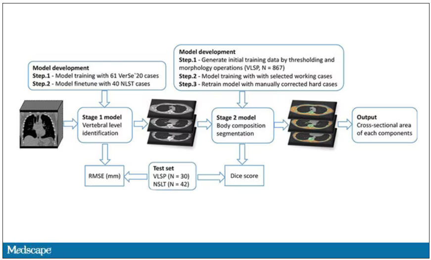
While the radiologists are busy looking for cancer or pneumonia, the AI can create a body composition report – two results from one data stream.
Here’s an example of a report generated from a CT scan from the authors’ GitHub page.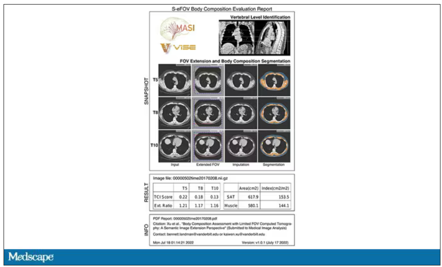
The cool thing here is that this is a clinically collected CT scan of the chest, not a special protocol designed to assess body composition. In fact, this comes from the low-dose lung cancer screening trial dataset.
As you may know, the U.S. Preventive Services Task Force recommends low-dose CT screening of the chest every year for those aged 50-80 with at least a 20 pack-year smoking history. These CT scans form an incredible dataset, actually, as they are all collected with nearly the same parameters. Obviously, the important thing to look for in these CT scans is whether there is early lung cancer. But the new paper asks, as long as we can get information about body composition from these scans, why don’t we? Can it help to risk-stratify these patients?
They took 20,768 individuals with CT scans done as part of the low-dose lung cancer screening trial and passed their scans through their automated data pipeline.
One cool feature here: Depending on body size, sometimes the edges of people in CT scans are not visible. That’s not a big deal for lung-cancer screening as long as you can see both lungs. But it does matter for assessment of muscle and body fat because that stuff lives on the edges of the thoracic cavity. The authors’ data pipeline actually accounts for this, extrapolating what the missing pieces look like from what is able to be seen. It’s quite clever.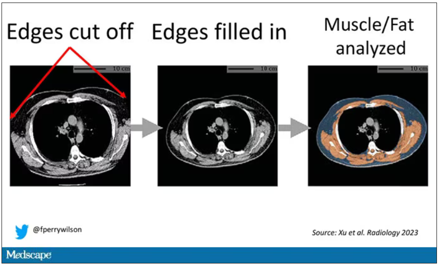
On to some results. Would knowledge about the patient’s body composition help predict their ultimate outcome?
It would. And the best single predictor found was skeletal muscle attenuation – lower levels of skeletal muscle attenuation mean more fat infiltrating the muscle – so lower is worse here. You can see from these all-cause mortality curves that lower levels were associated with substantially worse life expectancy.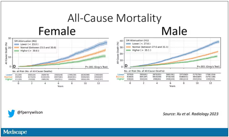
It’s worth noting that these are unadjusted curves. While AI prediction from CT images is very cool, we might be able to make similar predictions knowing, for example, the age of the patient. To account for this, the authors adjusted the findings for age, diabetes, heart disease, stroke, and coronary calcium score (also calculated from those same CT scans). Even after adjustment, skeletal muscle attenuation was significantly associated with all-cause mortality, cardiovascular mortality, and lung-cancer mortality – but not lung cancer incidence.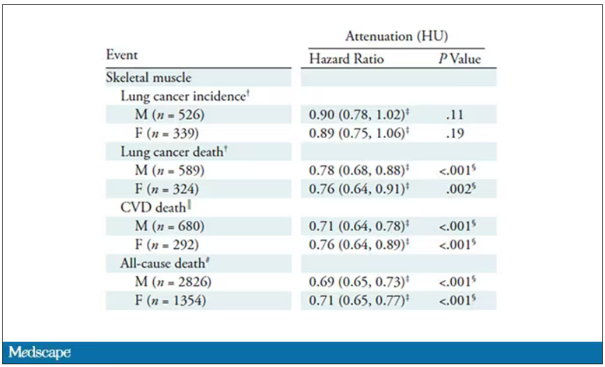
Those results tell us that there is likely a physiologic significance to skeletal muscle attenuation, and they provide a great proof-of-concept that automated data extraction techniques can be applied broadly to routinely collected radiology images.
That said, it’s one thing to show that something is physiologically relevant. In terms of actually predicting outcomes, adding this information to a model that contains just those clinical factors like age and diabetes doesn’t actually improve things very much. We measure this with something called the concordance index. This tells us the probability, given two individuals, of how often we can identify the person who has the outcome of interest sooner – if at all. (You can probably guess that the worst possible score is thus 0.5 and the best is 1.) A model without the AI data gives a concordance index for all-cause mortality of 0.71 or 0.72, depending on sex. Adding in the body composition data bumps that up only by a percent or so.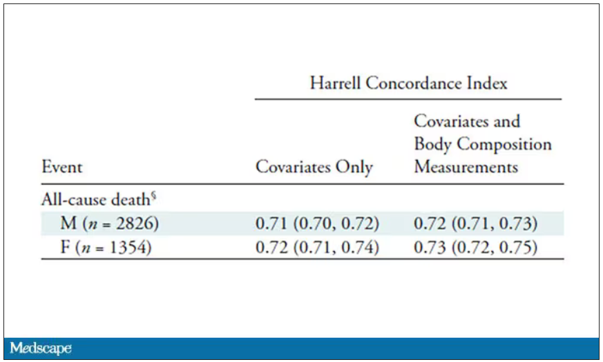
This honestly feels a bit like a missed opportunity to me. The authors pass the imaging data through an AI to get body composition data and then see how that predicts death.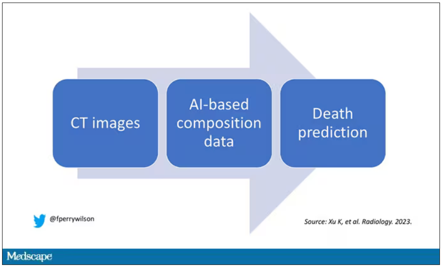
Why not skip the middleman? Train a model using the imaging data to predict death directly, using whatever signal the AI chooses: body composition, lung size, rib thickness – whatever.
I’d be very curious to see how that model might improve our ability to predict these outcomes. In the end, this is a space where AI can make some massive gains – not by trying to do radiologists’ jobs better than radiologists, but by extracting information that radiologists aren’t looking for in the first place.
F. Perry Wilson, MD, MSCE, is associate professor of medicine and public health and director of Yale’s Clinical and Translational Research Accelerator in New Haven, Conn. He reported no conflicts of interest.
A version of this article first appeared on Medscape.com.
This transcript has been edited for clarity.
If a picture is worth a thousand words, then a CT scan of the chest might as well be Atlas Shrugged. When you think of the sheer information content in one of those scans, it becomes immediately clear that our usual method of CT scan interpretation must be leaving a lot on the table. After all, we can go through all that information and come out with simply “normal” and call it a day.
Of course, radiologists can glean a lot from a CT scan, but they are trained to look for abnormalities. They can find pneumonia, emboli, fractures, and pneumothoraces, but the presence or absence of life-threatening abnormalities is still just a fraction of the data contained within a CT scan.
Pulling out more data from those images – data that may not indicate disease per se, but nevertheless tell us something important about patients and their risks – might just fall to those entities that are primed to take a bunch of data and interpret it in new ways: artificial intelligence (AI).
I’m thinking about AI and CT scans this week thanks to this study, appearing in the journal Radiology, from Kaiwen Xu and colleagues at Vanderbilt.
In a previous study, the team had developed an AI algorithm to take chest CT images and convert that data into information about body composition: skeletal muscle mass, fat mass, muscle lipid content – that sort of thing.
While the radiologists are busy looking for cancer or pneumonia, the AI can create a body composition report – two results from one data stream.
Here’s an example of a report generated from a CT scan from the authors’ GitHub page.
The cool thing here is that this is a clinically collected CT scan of the chest, not a special protocol designed to assess body composition. In fact, this comes from the low-dose lung cancer screening trial dataset.
As you may know, the U.S. Preventive Services Task Force recommends low-dose CT screening of the chest every year for those aged 50-80 with at least a 20 pack-year smoking history. These CT scans form an incredible dataset, actually, as they are all collected with nearly the same parameters. Obviously, the important thing to look for in these CT scans is whether there is early lung cancer. But the new paper asks, as long as we can get information about body composition from these scans, why don’t we? Can it help to risk-stratify these patients?
They took 20,768 individuals with CT scans done as part of the low-dose lung cancer screening trial and passed their scans through their automated data pipeline.
One cool feature here: Depending on body size, sometimes the edges of people in CT scans are not visible. That’s not a big deal for lung-cancer screening as long as you can see both lungs. But it does matter for assessment of muscle and body fat because that stuff lives on the edges of the thoracic cavity. The authors’ data pipeline actually accounts for this, extrapolating what the missing pieces look like from what is able to be seen. It’s quite clever.
On to some results. Would knowledge about the patient’s body composition help predict their ultimate outcome?
It would. And the best single predictor found was skeletal muscle attenuation – lower levels of skeletal muscle attenuation mean more fat infiltrating the muscle – so lower is worse here. You can see from these all-cause mortality curves that lower levels were associated with substantially worse life expectancy.
It’s worth noting that these are unadjusted curves. While AI prediction from CT images is very cool, we might be able to make similar predictions knowing, for example, the age of the patient. To account for this, the authors adjusted the findings for age, diabetes, heart disease, stroke, and coronary calcium score (also calculated from those same CT scans). Even after adjustment, skeletal muscle attenuation was significantly associated with all-cause mortality, cardiovascular mortality, and lung-cancer mortality – but not lung cancer incidence.
Those results tell us that there is likely a physiologic significance to skeletal muscle attenuation, and they provide a great proof-of-concept that automated data extraction techniques can be applied broadly to routinely collected radiology images.
That said, it’s one thing to show that something is physiologically relevant. In terms of actually predicting outcomes, adding this information to a model that contains just those clinical factors like age and diabetes doesn’t actually improve things very much. We measure this with something called the concordance index. This tells us the probability, given two individuals, of how often we can identify the person who has the outcome of interest sooner – if at all. (You can probably guess that the worst possible score is thus 0.5 and the best is 1.) A model without the AI data gives a concordance index for all-cause mortality of 0.71 or 0.72, depending on sex. Adding in the body composition data bumps that up only by a percent or so.
This honestly feels a bit like a missed opportunity to me. The authors pass the imaging data through an AI to get body composition data and then see how that predicts death.
Why not skip the middleman? Train a model using the imaging data to predict death directly, using whatever signal the AI chooses: body composition, lung size, rib thickness – whatever.
I’d be very curious to see how that model might improve our ability to predict these outcomes. In the end, this is a space where AI can make some massive gains – not by trying to do radiologists’ jobs better than radiologists, but by extracting information that radiologists aren’t looking for in the first place.
F. Perry Wilson, MD, MSCE, is associate professor of medicine and public health and director of Yale’s Clinical and Translational Research Accelerator in New Haven, Conn. He reported no conflicts of interest.
A version of this article first appeared on Medscape.com.
This transcript has been edited for clarity.
If a picture is worth a thousand words, then a CT scan of the chest might as well be Atlas Shrugged. When you think of the sheer information content in one of those scans, it becomes immediately clear that our usual method of CT scan interpretation must be leaving a lot on the table. After all, we can go through all that information and come out with simply “normal” and call it a day.
Of course, radiologists can glean a lot from a CT scan, but they are trained to look for abnormalities. They can find pneumonia, emboli, fractures, and pneumothoraces, but the presence or absence of life-threatening abnormalities is still just a fraction of the data contained within a CT scan.
Pulling out more data from those images – data that may not indicate disease per se, but nevertheless tell us something important about patients and their risks – might just fall to those entities that are primed to take a bunch of data and interpret it in new ways: artificial intelligence (AI).
I’m thinking about AI and CT scans this week thanks to this study, appearing in the journal Radiology, from Kaiwen Xu and colleagues at Vanderbilt.
In a previous study, the team had developed an AI algorithm to take chest CT images and convert that data into information about body composition: skeletal muscle mass, fat mass, muscle lipid content – that sort of thing.
While the radiologists are busy looking for cancer or pneumonia, the AI can create a body composition report – two results from one data stream.
Here’s an example of a report generated from a CT scan from the authors’ GitHub page.
The cool thing here is that this is a clinically collected CT scan of the chest, not a special protocol designed to assess body composition. In fact, this comes from the low-dose lung cancer screening trial dataset.
As you may know, the U.S. Preventive Services Task Force recommends low-dose CT screening of the chest every year for those aged 50-80 with at least a 20 pack-year smoking history. These CT scans form an incredible dataset, actually, as they are all collected with nearly the same parameters. Obviously, the important thing to look for in these CT scans is whether there is early lung cancer. But the new paper asks, as long as we can get information about body composition from these scans, why don’t we? Can it help to risk-stratify these patients?
They took 20,768 individuals with CT scans done as part of the low-dose lung cancer screening trial and passed their scans through their automated data pipeline.
One cool feature here: Depending on body size, sometimes the edges of people in CT scans are not visible. That’s not a big deal for lung-cancer screening as long as you can see both lungs. But it does matter for assessment of muscle and body fat because that stuff lives on the edges of the thoracic cavity. The authors’ data pipeline actually accounts for this, extrapolating what the missing pieces look like from what is able to be seen. It’s quite clever.
On to some results. Would knowledge about the patient’s body composition help predict their ultimate outcome?
It would. And the best single predictor found was skeletal muscle attenuation – lower levels of skeletal muscle attenuation mean more fat infiltrating the muscle – so lower is worse here. You can see from these all-cause mortality curves that lower levels were associated with substantially worse life expectancy.
It’s worth noting that these are unadjusted curves. While AI prediction from CT images is very cool, we might be able to make similar predictions knowing, for example, the age of the patient. To account for this, the authors adjusted the findings for age, diabetes, heart disease, stroke, and coronary calcium score (also calculated from those same CT scans). Even after adjustment, skeletal muscle attenuation was significantly associated with all-cause mortality, cardiovascular mortality, and lung-cancer mortality – but not lung cancer incidence.
Those results tell us that there is likely a physiologic significance to skeletal muscle attenuation, and they provide a great proof-of-concept that automated data extraction techniques can be applied broadly to routinely collected radiology images.
That said, it’s one thing to show that something is physiologically relevant. In terms of actually predicting outcomes, adding this information to a model that contains just those clinical factors like age and diabetes doesn’t actually improve things very much. We measure this with something called the concordance index. This tells us the probability, given two individuals, of how often we can identify the person who has the outcome of interest sooner – if at all. (You can probably guess that the worst possible score is thus 0.5 and the best is 1.) A model without the AI data gives a concordance index for all-cause mortality of 0.71 or 0.72, depending on sex. Adding in the body composition data bumps that up only by a percent or so.
This honestly feels a bit like a missed opportunity to me. The authors pass the imaging data through an AI to get body composition data and then see how that predicts death.
Why not skip the middleman? Train a model using the imaging data to predict death directly, using whatever signal the AI chooses: body composition, lung size, rib thickness – whatever.
I’d be very curious to see how that model might improve our ability to predict these outcomes. In the end, this is a space where AI can make some massive gains – not by trying to do radiologists’ jobs better than radiologists, but by extracting information that radiologists aren’t looking for in the first place.
F. Perry Wilson, MD, MSCE, is associate professor of medicine and public health and director of Yale’s Clinical and Translational Research Accelerator in New Haven, Conn. He reported no conflicts of interest.
A version of this article first appeared on Medscape.com.
The surprising occupations with higher-than-expected ovarian cancer rates
This transcript has been edited for clarity.
Welcome to Impact Factor, your weekly dose of commentary on a new medical study.
Basically, all cancers are caused by a mix of genetic and environmental factors, with some cancers driven more strongly by one or the other. When it comes to ovarian cancer, which kills more than 13,000 women per year in the United States, genetic factors like the BRCA gene mutations are well described.
Other risk factors, like early menarche and nulliparity, are difficult to modify. The only slam-dunk environmental toxin to be linked to ovarian cancer is asbestos. Still, the vast majority of women who develop ovarian cancer do not have a known high-risk gene or asbestos exposure, so other triggers may be out there. How do we find them? The answer may just be good old-fashioned epidemiology.
That’s just what researchers, led by Anita Koushik at the University of Montreal, did in a new study appearing in the journal Occupational and Environmental Medicine.
They identified 497 women in Montreal who had recently been diagnosed with ovarian cancer. They then matched those women to 897 women without ovarian cancer, based on age and address. (This approach would not work well in the United States, as diagnosis of ovarian cancer might depend on access to medical care, which is not universal here. In Canada, however, it’s safer to assume that anyone who could have gotten ovarian cancer in Montreal would have been detected.)
Cases and controls identified, the researchers took a detailed occupational history for each participant: every job they ever worked, and when, and for how long. Each occupation was mapped to a standardized set of industries and, interestingly, to a set of environmental exposures ranging from cosmetic talc to cooking fumes to cotton dust, in what is known as a job-exposure matrix. Of course, they also collected data on other ovarian cancer risk factors.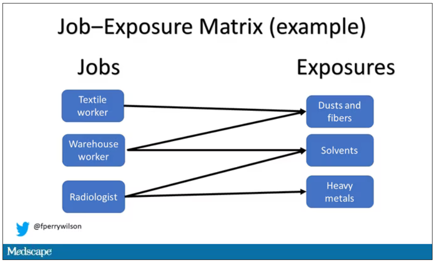
After that, it’s a simple matter of looking at the rate of ovarian cancer by occupation and occupation-associated exposures, accounting for differences in things like pregnancy rates.
A brief aside here. I was at dinner with my wife the other night and telling her about this study, and I asked, “What do you think the occupation with the highest rate of ovarian cancer is?” And without missing a beat, she said: “Hairdressers.” Which blew my mind because of how random that was, but she was also – as usual – 100% correct.
Hairdressers, at least those who had been in the industry for more than 10 years, had a threefold higher risk for ovarian cancer than matched controls who had never been hairdressers.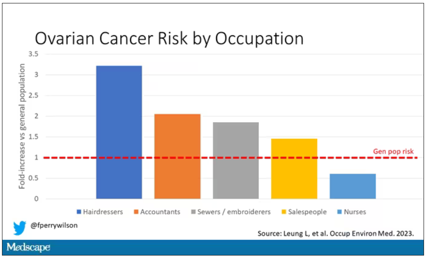
Of course, my wife is a cancer surgeon, so she has a bit of a leg up on me here. Many of you may also know that there is actually a decent body of literature showing higher rates of various cancers among hairdressers, presumably due to the variety of chemicals they are exposed to on a continuous basis.
The No. 2 highest-risk profession on the list? Accountants, with about a twofold higher risk. That one is more of a puzzler. It could be a false positive; after all, there were multiple occupations checked and random error might give a few hits that are meaningless. But there are certainly some occupational factors unique to accountants that might bear further investigation – maybe exposure to volatile organic compounds from office printers, or just a particularly sedentary office environment.
In terms of specific exposures, there were high risks seen with mononuclear aromatic hydrocarbons, bleaches, ethanol, and fluorocarbons, among others, but we have to be a bit more careful here. These exposures were not directly measured. Rather, based on the job category a woman described, the exposures were imputed based on the job-exposure matrix. As such, the correlations between the job and the particular exposure are really quite high, making it essentially impossible to tease out whether it is, for example, being a hairdresser, or being exposed to fluorocarbons as a hairdresser, or being exposed to something else as a hairdresser, that is the problem.
This is how these types of studies work; they tend to raise more questions than they answer. But in a world where a cancer diagnosis can seem to come completely out of the blue, they provide the starting point that someday may lead to a more definitive culprit agent or group of agents. Until then, it might be wise for hairdressers to make sure their workplace is well ventilated.
F. Perry Wilson, MD, MSCE, is an associate professor of medicine and director of Yale University’s Clinical and Translational Research Accelerator in New Haven, Conn. He reported no conflicts of interest.
A version of this article first appeared on Medscape.com.
This transcript has been edited for clarity.
Welcome to Impact Factor, your weekly dose of commentary on a new medical study.
Basically, all cancers are caused by a mix of genetic and environmental factors, with some cancers driven more strongly by one or the other. When it comes to ovarian cancer, which kills more than 13,000 women per year in the United States, genetic factors like the BRCA gene mutations are well described.
Other risk factors, like early menarche and nulliparity, are difficult to modify. The only slam-dunk environmental toxin to be linked to ovarian cancer is asbestos. Still, the vast majority of women who develop ovarian cancer do not have a known high-risk gene or asbestos exposure, so other triggers may be out there. How do we find them? The answer may just be good old-fashioned epidemiology.
That’s just what researchers, led by Anita Koushik at the University of Montreal, did in a new study appearing in the journal Occupational and Environmental Medicine.
They identified 497 women in Montreal who had recently been diagnosed with ovarian cancer. They then matched those women to 897 women without ovarian cancer, based on age and address. (This approach would not work well in the United States, as diagnosis of ovarian cancer might depend on access to medical care, which is not universal here. In Canada, however, it’s safer to assume that anyone who could have gotten ovarian cancer in Montreal would have been detected.)
Cases and controls identified, the researchers took a detailed occupational history for each participant: every job they ever worked, and when, and for how long. Each occupation was mapped to a standardized set of industries and, interestingly, to a set of environmental exposures ranging from cosmetic talc to cooking fumes to cotton dust, in what is known as a job-exposure matrix. Of course, they also collected data on other ovarian cancer risk factors.
After that, it’s a simple matter of looking at the rate of ovarian cancer by occupation and occupation-associated exposures, accounting for differences in things like pregnancy rates.
A brief aside here. I was at dinner with my wife the other night and telling her about this study, and I asked, “What do you think the occupation with the highest rate of ovarian cancer is?” And without missing a beat, she said: “Hairdressers.” Which blew my mind because of how random that was, but she was also – as usual – 100% correct.
Hairdressers, at least those who had been in the industry for more than 10 years, had a threefold higher risk for ovarian cancer than matched controls who had never been hairdressers.
Of course, my wife is a cancer surgeon, so she has a bit of a leg up on me here. Many of you may also know that there is actually a decent body of literature showing higher rates of various cancers among hairdressers, presumably due to the variety of chemicals they are exposed to on a continuous basis.
The No. 2 highest-risk profession on the list? Accountants, with about a twofold higher risk. That one is more of a puzzler. It could be a false positive; after all, there were multiple occupations checked and random error might give a few hits that are meaningless. But there are certainly some occupational factors unique to accountants that might bear further investigation – maybe exposure to volatile organic compounds from office printers, or just a particularly sedentary office environment.
In terms of specific exposures, there were high risks seen with mononuclear aromatic hydrocarbons, bleaches, ethanol, and fluorocarbons, among others, but we have to be a bit more careful here. These exposures were not directly measured. Rather, based on the job category a woman described, the exposures were imputed based on the job-exposure matrix. As such, the correlations between the job and the particular exposure are really quite high, making it essentially impossible to tease out whether it is, for example, being a hairdresser, or being exposed to fluorocarbons as a hairdresser, or being exposed to something else as a hairdresser, that is the problem.
This is how these types of studies work; they tend to raise more questions than they answer. But in a world where a cancer diagnosis can seem to come completely out of the blue, they provide the starting point that someday may lead to a more definitive culprit agent or group of agents. Until then, it might be wise for hairdressers to make sure their workplace is well ventilated.
F. Perry Wilson, MD, MSCE, is an associate professor of medicine and director of Yale University’s Clinical and Translational Research Accelerator in New Haven, Conn. He reported no conflicts of interest.
A version of this article first appeared on Medscape.com.
This transcript has been edited for clarity.
Welcome to Impact Factor, your weekly dose of commentary on a new medical study.
Basically, all cancers are caused by a mix of genetic and environmental factors, with some cancers driven more strongly by one or the other. When it comes to ovarian cancer, which kills more than 13,000 women per year in the United States, genetic factors like the BRCA gene mutations are well described.
Other risk factors, like early menarche and nulliparity, are difficult to modify. The only slam-dunk environmental toxin to be linked to ovarian cancer is asbestos. Still, the vast majority of women who develop ovarian cancer do not have a known high-risk gene or asbestos exposure, so other triggers may be out there. How do we find them? The answer may just be good old-fashioned epidemiology.
That’s just what researchers, led by Anita Koushik at the University of Montreal, did in a new study appearing in the journal Occupational and Environmental Medicine.
They identified 497 women in Montreal who had recently been diagnosed with ovarian cancer. They then matched those women to 897 women without ovarian cancer, based on age and address. (This approach would not work well in the United States, as diagnosis of ovarian cancer might depend on access to medical care, which is not universal here. In Canada, however, it’s safer to assume that anyone who could have gotten ovarian cancer in Montreal would have been detected.)
Cases and controls identified, the researchers took a detailed occupational history for each participant: every job they ever worked, and when, and for how long. Each occupation was mapped to a standardized set of industries and, interestingly, to a set of environmental exposures ranging from cosmetic talc to cooking fumes to cotton dust, in what is known as a job-exposure matrix. Of course, they also collected data on other ovarian cancer risk factors.
After that, it’s a simple matter of looking at the rate of ovarian cancer by occupation and occupation-associated exposures, accounting for differences in things like pregnancy rates.
A brief aside here. I was at dinner with my wife the other night and telling her about this study, and I asked, “What do you think the occupation with the highest rate of ovarian cancer is?” And without missing a beat, she said: “Hairdressers.” Which blew my mind because of how random that was, but she was also – as usual – 100% correct.
Hairdressers, at least those who had been in the industry for more than 10 years, had a threefold higher risk for ovarian cancer than matched controls who had never been hairdressers.
Of course, my wife is a cancer surgeon, so she has a bit of a leg up on me here. Many of you may also know that there is actually a decent body of literature showing higher rates of various cancers among hairdressers, presumably due to the variety of chemicals they are exposed to on a continuous basis.
The No. 2 highest-risk profession on the list? Accountants, with about a twofold higher risk. That one is more of a puzzler. It could be a false positive; after all, there were multiple occupations checked and random error might give a few hits that are meaningless. But there are certainly some occupational factors unique to accountants that might bear further investigation – maybe exposure to volatile organic compounds from office printers, or just a particularly sedentary office environment.
In terms of specific exposures, there were high risks seen with mononuclear aromatic hydrocarbons, bleaches, ethanol, and fluorocarbons, among others, but we have to be a bit more careful here. These exposures were not directly measured. Rather, based on the job category a woman described, the exposures were imputed based on the job-exposure matrix. As such, the correlations between the job and the particular exposure are really quite high, making it essentially impossible to tease out whether it is, for example, being a hairdresser, or being exposed to fluorocarbons as a hairdresser, or being exposed to something else as a hairdresser, that is the problem.
This is how these types of studies work; they tend to raise more questions than they answer. But in a world where a cancer diagnosis can seem to come completely out of the blue, they provide the starting point that someday may lead to a more definitive culprit agent or group of agents. Until then, it might be wise for hairdressers to make sure their workplace is well ventilated.
F. Perry Wilson, MD, MSCE, is an associate professor of medicine and director of Yale University’s Clinical and Translational Research Accelerator in New Haven, Conn. He reported no conflicts of interest.
A version of this article first appeared on Medscape.com.
